
I bet the new one also feels a bit more empty inside.
Cause of existential dread, or Shrinkflation?
yes
Shrinkflation and possibly exstential dread I don’t have the same life experience of a tube of chips!
Cause he can’t keep friends anymore
Because I ate his insides
Yeah if you can get your hand more than a third of the way into it.
And his bow tie
I think the text is meant to be his bowtie now
What a stupid design choice
Nah, i think the design choice is fine. It’s the execution that is lacking.
Much less cool.
Did he also debate John Stewart?
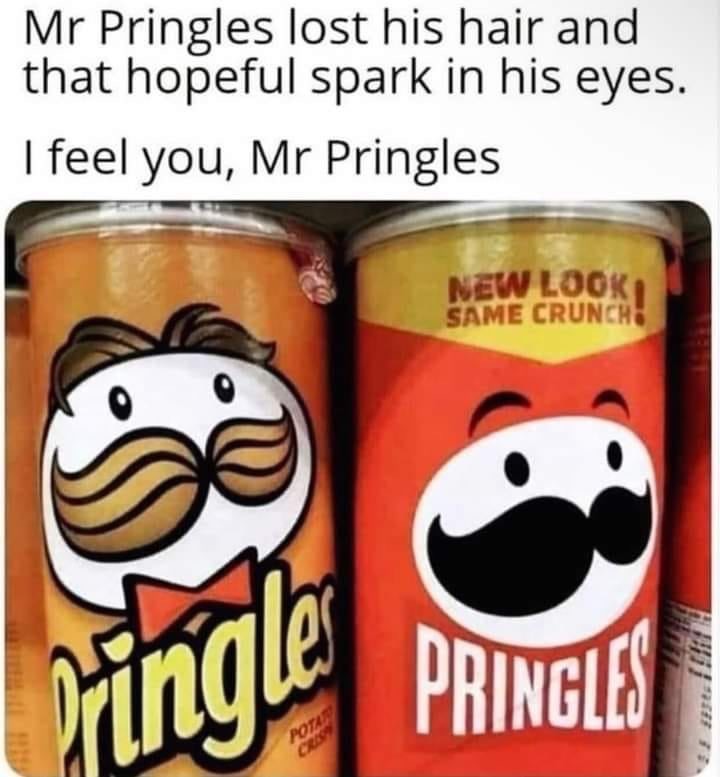
Glazed over eyes, thinning hairline; Mr. Pringle remembered back to when he first started as mascot all those years ago - life seemed so full of promise. Now he found himself stuck in middle age - his wife doesn’t listen to him anymore, he’s begun dying his graying mustache black. As he stared blankly out from the container, he wondered - can one ever really regain that which has been lost? Mr. Pringle had the experience - he just wished he had the answers…
Look how they massacred my boy
The flat design saves ink and lowers costs. Anything to save a penny and increase profits.
It’s more that corporates are brainwashed into thinking vector and minimalist art is more beneficial.
Next version will just be a white oval.
It’s notably a shift toward iconography in an effort to make it look more modern. These simpler vector designs can also be more easily used at smaller sizes
 .
.That’s a good point.
Easier to work with as well. They can easily outsource slight variations of the logo (for example Mr. Pringles wearing gaming headset) when necessary.
It’s mostly because people consume most content via apps and the web on smart phones now that have screens that are anywhere from 4.5" - 6.5" in size, and sadly more complex logos just don’t look that good when they’re squished into an area that’s a fraction of the total screen size. Where as in the past people might see a Pringles ad or anything related to Pringles on the TV, in a news paper, on a billboard etc which have way more space so the details are visible.
It is pretty unfortunate though, it’s the same reason the Firefox logo (and like everything else lol) was made minimalistic. I miss the old Firefox logo, I didn’t use Firefox in 2005-2009 but that one is definitely my favourite, the 2009-2013 one is nice too though which is when I first started using FF I think. Compared to today’s logo even the 2013-2017 one is great though
Maybe the savings are going into more chips and/or quality?
Hahahahahaha!!!
No man, it’s going into the shareholders’ pockets. That’s the whole point of capitalism. That’s the basic rule of the game.
Are they really charged by how much ink they use though? I would have thought cost was a per unit.
Ya. I run a print shop, and you’d be surprised how much ink consumption increases cost. Not to mention which colours are used. You need to use multiple colours of ink in specific ratios to create other colours.
I once dreaded the loss of 2000’s aesthetic.
But I’m just glad now that the modern aesthetic matches the modern mood.
Minimalism is the death of Modern Art
I disagree, but I do think that this particular redesign is some of the worst. Not sure how that got approved, even from a brand recognition standpoint. It genuinely looks like an off brand.
Yeah I can’t wait for the minimalism fad to die off
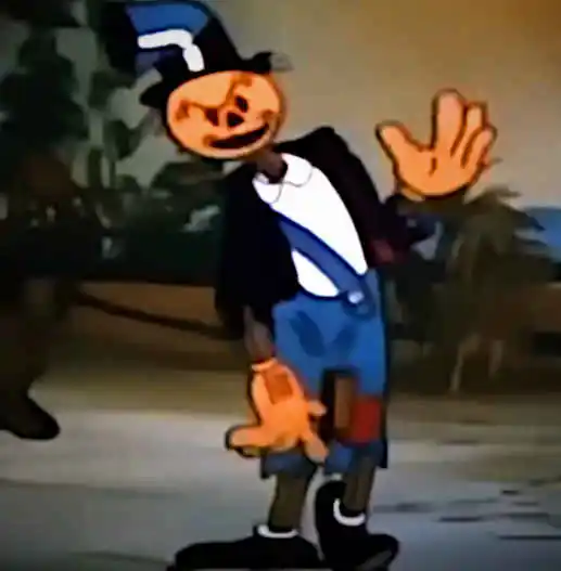
He got the flat design treatment.
And bowtie. Bowties are cool!
His solid black mass of mustache makes him look like he has an obscenely happy bird beak
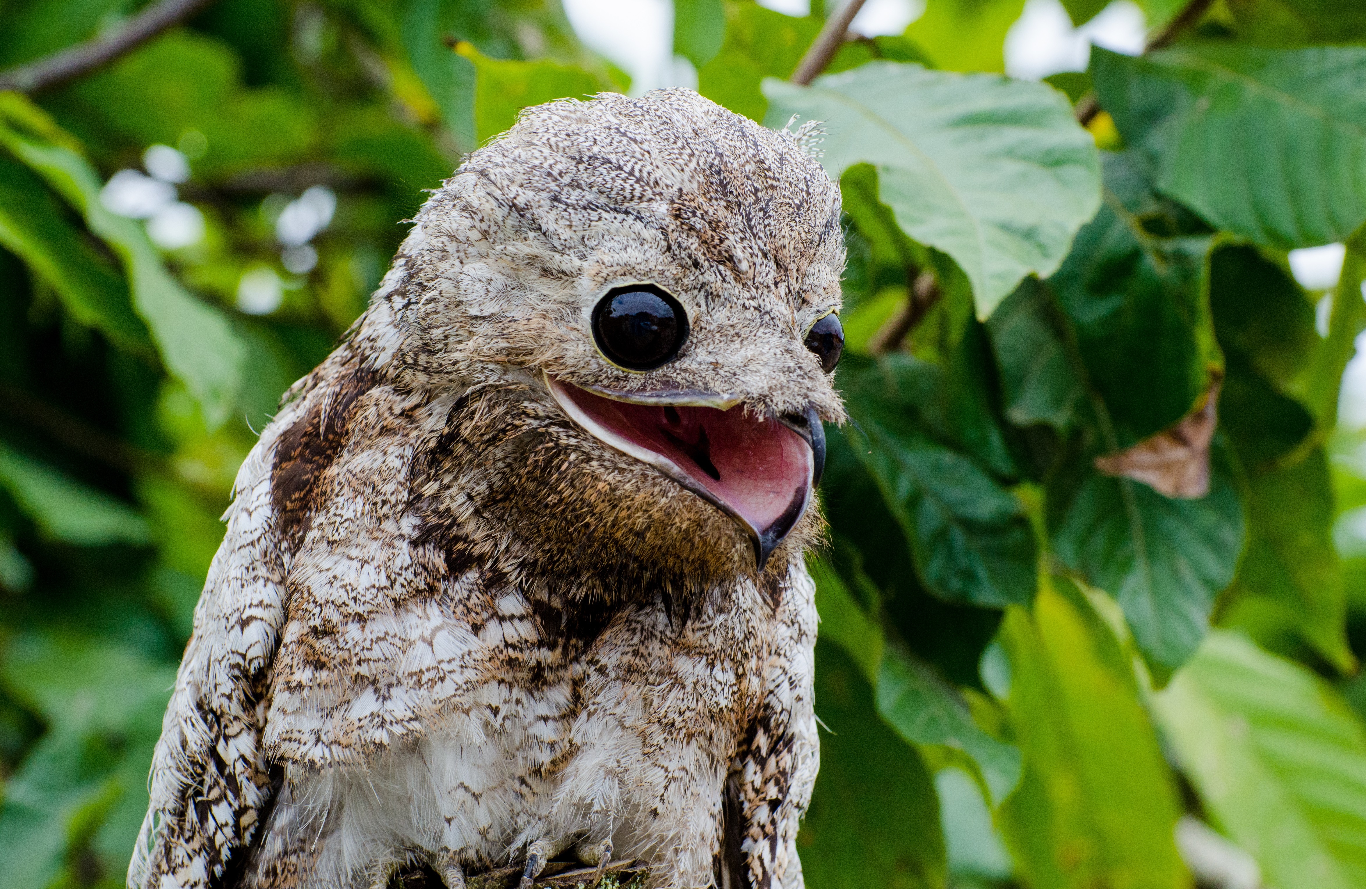
Edit: this image isn’t photoshopped. It’s a potoo. They just look like that.
deleted by creator
They probably were going for that hello kitty psychological thing. For people not wanting to look it up, I believe it means hello kitty’s success as a symbol is in part due to her have a blank look that people transpose their own feelings/interpretations onto.
I would also assume they wanted to use less ink colors.
Jokes on them. The printer will still stop working when “magenta” is low.
I can see that. He definitely went from 30’s something hipster that was the in look a few years back to a more universal look. Someone else mentioned seeing a really happy smiling bird beak, which I can see little kids seeing (like a Rorschach test) instead of the mustache that adults see.
How can they fail so hard at that?
He grew eyebrows though
Mr pringles probably worked retail. that destroys any soul
Those were his eyebrows TBH
Where is the “they finally did it, they broke him” meme when you need it.


