Pinball@lemmy.wtf to Gaming@beehaw.orgEnglish · 2 years agoVisualized: $300B of Video Gaming Revenue, by Sourcewww.visualcapitalist.comexternal-linkmessage-square27fedilinkarrow-up150arrow-down11file-text
arrow-up149arrow-down1external-linkVisualized: $300B of Video Gaming Revenue, by Sourcewww.visualcapitalist.comPinball@lemmy.wtf to Gaming@beehaw.orgEnglish · 2 years agomessage-square27fedilinkfile-text
minus-squareVeniconlinkfedilinkarrow-up4·2 years agoKinda confusing how the amounts go up but the shape of the chart goes down
minus-squareAdramis [he/him]@beehaw.orglinkfedilinkarrow-up3·2 years agoYeah, I feel like just flipping the chart would make it make more intuitive sense. I do like the choice of colors at least.

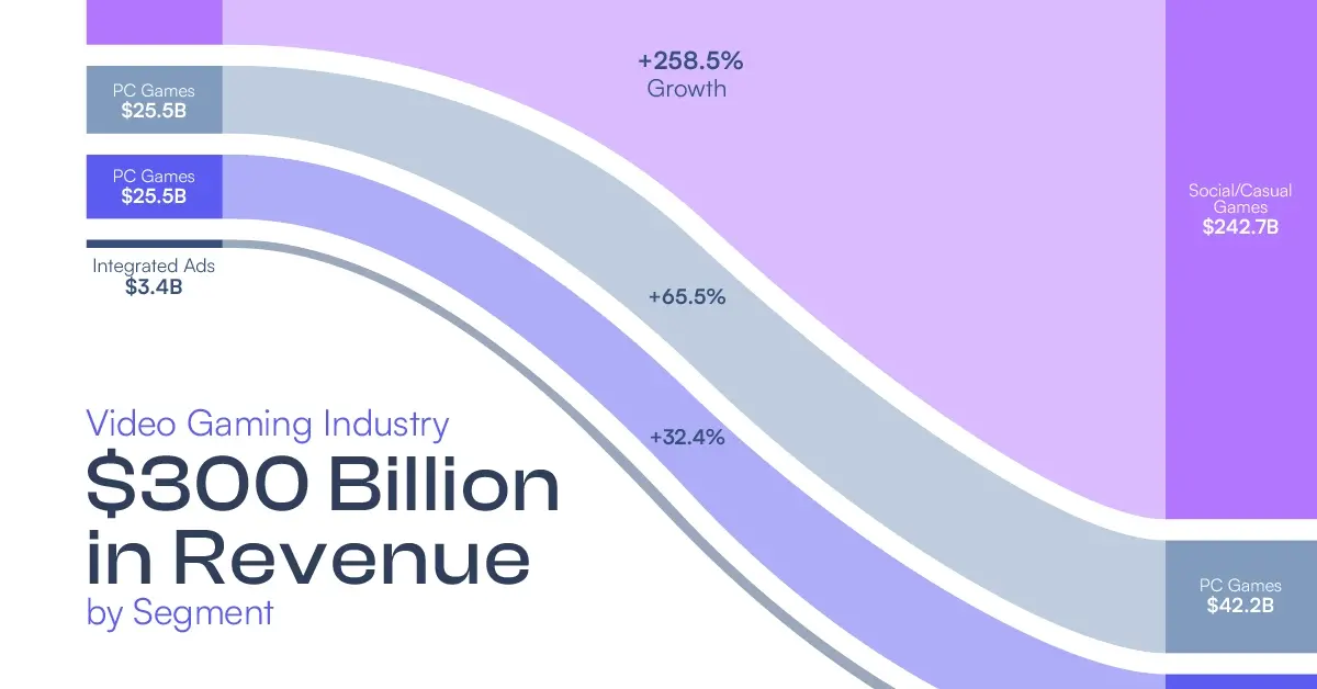
Kinda confusing how the amounts go up but the shape of the chart goes down
Yeah, I feel like just flipping the chart would make it make more intuitive sense. I do like the choice of colors at least.