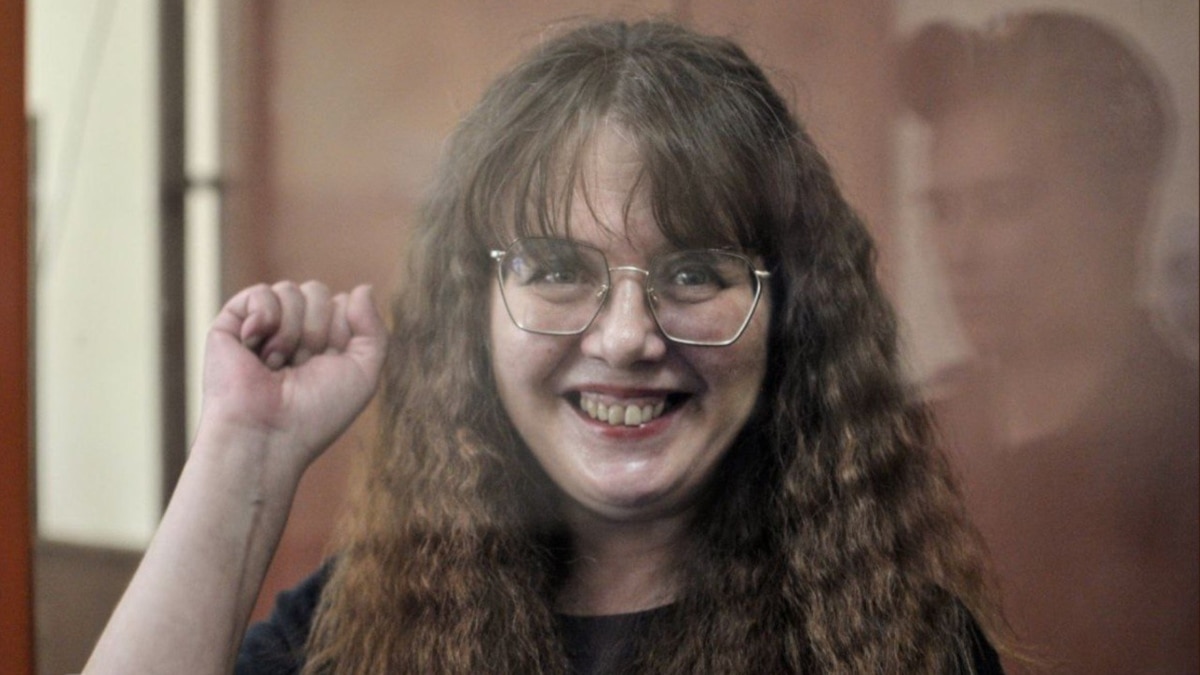
A court in the Russian city of St. Petersburg sentenced anti-war activist Olga Smirnova to six years in prison on August 30 on a charge of spreading fake news about the armed forces.
Yeah, well it might not be the best source, but at least they have a map that measures something interesting. The second best option would have been the map of press freedom index. It’s not quite the same things and it isn’t entirely relevant to the conversation either, but there you go. At least it tells you something about the attitude different countries have towards the media, which may or may not be associated with the attitude towards activists. This map also paints a slightly more nuanced picture, but the conclusion is largely the same as before.
Ukraine’s being yellow is just wrong. It doesn’t really matter if it’s fair, but with the ongoing war and the effects of it on the society and its attitudes towards press the color should be orange.

Yeah, well it might not be the best source, but at least they have a map that measures something interesting. The second best option would have been the map of press freedom index. It’s not quite the same things and it isn’t entirely relevant to the conversation either, but there you go. At least it tells you something about the attitude different countries have towards the media, which may or may not be associated with the attitude towards activists. This map also paints a slightly more nuanced picture, but the conclusion is largely the same as before.
See also: Wikipedia
Ukraine’s being yellow is just wrong. It doesn’t really matter if it’s fair, but with the ongoing war and the effects of it on the society and its attitudes towards press the color should be orange.