

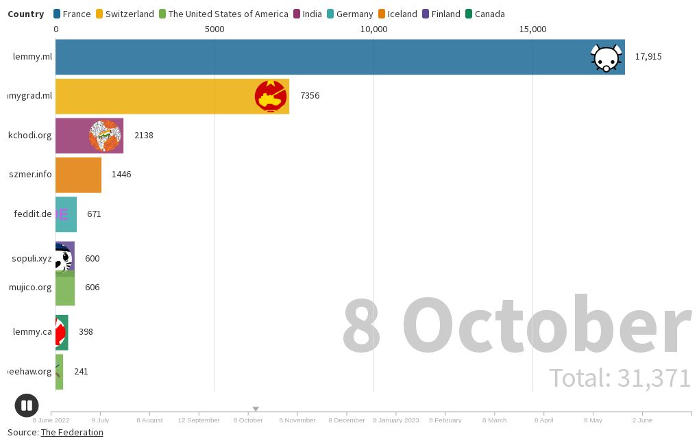
A timeline I created of the total users at the top 10 Lemmy instances as a bar chart race: https://public.flourish.studio/visualisation/14058992/ and as a line chart: https://public.flourish.studio/visualisation/14080522/.
A timeline I created of the total users at the top 10 Lemmy instances as a bar chart race: https://public.flourish.studio/visualisation/14058992/ and as a line chart: https://public.flourish.studio/visualisation/14080522/.
Yes, I plan to update it again after the 8th of July.
If you do update the post, maybe consider using an animated line graph. I find those usually show the change over time a lot better, because you see the total history of user count.
I think the bar graphs are really nice to show changes in the top position or when there are a lot of different „participants“ coming and going over the time of the graph.
Anyway, really nice animation. Only wanted to give my 2ct.