

- cross-posted to:
- traditional_art@lemmy.world
- turkey@lemmy.world
- cross-posted to:
- traditional_art@lemmy.world
- turkey@lemmy.world
You must log in or # to comment.
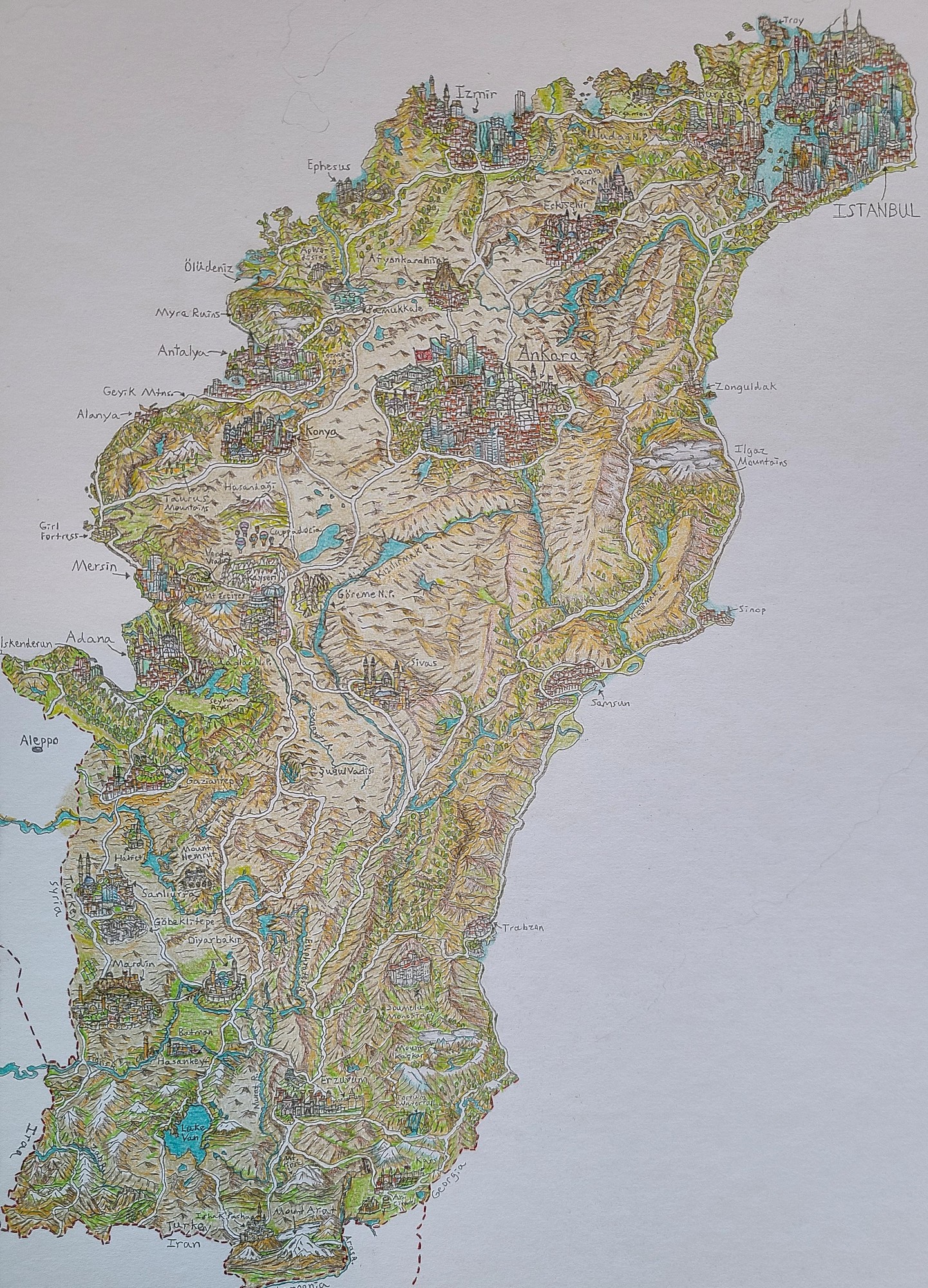
i think this is the first occidental map i’ve ever seen
Seems like the artist is basing it on this 1943 map by Richard Edes Harrison, which is from an atlas full of unusual perspectives that was aiming to illustrate WWII geopolitics for an American audience. Cook has a reddit post about it but the links are all broken now, so I’m not 100% certain that it’s this one, but it seems likely
It’s pretty, but i do not like maps where the land that’s not part of the subject and the water that are not part of the subject have the same colour. Same with those maps of cities where the streets at some point just fade-out. Not saying the artist should have done differently, just complaining about my defect.

Wait. No. You didn’t. Why is West at the top?

