I’m swimming-with-mermaids delighted to reveal the cover of my next solarpunk mystery novel, Missing Mermaid. Right now I’m deciding how best to arrange the text on the cover. Do you recommend option one (author name on her tail) or option two (author name and title both up in the sky)?
The illustration is by Nell Fallcard. You can order the ebook, internationally, on the indie site Smashwords after its release on May 24th. You can preorder the book on Amazon. The paperback will come later on Barnes and Noble.
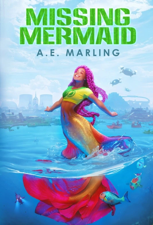
Both in the sky seem better.
Is it intentional that there is what looks like a big atomic power-plant in the background?
Good eye.
Yes, in this city there is a fusion power plant. Whether fission power is worthwhile has been a lively debate. Fusion represents a more aspirational goal. In this story it is paired with DAC plants to remove carbon from the atmosphere, another aspirational technology that will be necessary in some form to reverse climate change.
None of you caught it, but apparently AI stole art to make this image. My intention was to hire and fairly pay an illustrator. I sourced Nell Fallcard through Art Station, searching for mermaids, filtering out AI art. She met those criteria. However, I do see that recently she has used AI. Her bio’s did not mention AI art, and on her recent pieces I saw that she had used blender, photoshop, and I was less familiar with AI apps and did not spot those. Reddit users voiced concerns that the art was stolen by AI. I hired an independent artist to look the piece over. She determined it was likely AI. To see her analysis, follow this link.
Even given her explanation, I find it unlikely I would be detect similar AI thefts. I will have to be more careful in hiring illustrators in future. My graphic designer also used AI art to make a back cover. I caught that and had him redo it. The front cover was not obvious to me. There are few things less solarpunk that stealing work from artists. I will not be publishing my novel with AI art, which means the release date for Missing Mermaid will be postponed. If you know illustrators who would be excited to work on a solarpunk piece featuring mermaids, do tell.
Unfortunately, Nell Fallcard herself made a video defending the use of AI, so I think it’s safe to say that it is an AI assisted image.
I’m sorry you had to find out so close to your release, Marling :(
!imaginarymerfolk@lemmy.dbzer0.com may be a useful resource for finding mermaid artists.
To see her analysis, follow this link.
There’s no URL in that link.
It was pretty clearly AI. The braids and tail make no sense
I don’t think that’s so obvious and I would also caution people to not go on witch-hunts on what can clearly be a grey area. Artists assembling images out of various sources is not uncommon and due to the abundance of AI generated images these days they might not even have been aware.
It is IMHO also false to call AI generating images stealing, its a bit more complex than that. But I fully understand and respect if someone doesn’t want to use AI generated imagery over ethical concerns.
Okay well I think your just wrong. Hell, even the law thinks your wrong. Using art as reference can be dangerous if your work is not meaningfully different and you pass it off as your own. Scott Cawthon got into trouble a few years back after one of his hired artists used a fanart model of a version of one or the characters as reference for a promotional piece.
I like them both up top. It makes the image pop more & looks more traditionally bookish to me.
I think splitting makes the most sense for covers that have a series title up top by the book title.
I do think they both look good & it doesn’t make too much of a difference.
Good luck with you book launch :) I know it can be a tough market for new/indie writers
Thanks!
The market is horrible, but what I care more about is spreading solarpunk ideas in a fun way. 💚
That’s a great mindset to have. I write as well & it’s for the love of craft, definetly not the paycheck lol
Stories are just so fun to tell, I’m looking forward to reading yours :)
Hey! I have Murder in the Tool Library on my device to read next. Cool!
Hope you enjoy Murder in the Tool Library. Wishing you greener futures.
Another vote for the two up top, just looks more professional for some reason.
They both look great with a slight preference for #2 since it lets the illustration shine!
Hmh. I like having the title down below. Gives me a more polished vibe, dunno why.
This looks great! I think I also like the cover with the text split up, but both look polished to me.
<deleting accidental double post>
I really appreciate you doing a lot of work to make sure it’s not AI made, automating art is antithetical to the solarpunk philosophy.
This cover scares me
Why?
Because I feel like I fall into the water
It is damn awesome though
I like option 2, I thought I would prefer Option 1 before I saw 2 but it’s executed really well in 2! Also, that illustration is gorgeous, and thank you for sharing the illustrator’s details. I want my next novel to be solarpunk, and I am definitely in the market for a new cover artist…
I need to add this and Murder in the Tool Library to my storygraph. And preorder/buy a copy of both tbh.
I wish you the best with your own solarpunk writing. Be careful when hiring an illustrator. I’ve had some issues avoiding AI art.
Hope you enjoy Murder in the Tool Library. Wishing you greener futures.
I much prefer option 2.

