
3·
4 days agoWhich country?
Which country?
Ugh, same. Really any memespeak, even if it’s far older than the internet. Growing up every social group seemed to have a child who would endlessly quote movies. Somehow this is worse.
The most unpleasant may be “Imagine…” followed by some convoluted story. It always feels like an attempt to slightly disguise bullying. Even when it’s directed at a detestable public figure, and it feels like a useful rhetorical construct.
If the question were about books instead of movies/shows Anne of Green Gables would be my answer.
The show’s on my list to watch, but that only grows, never shrinks.
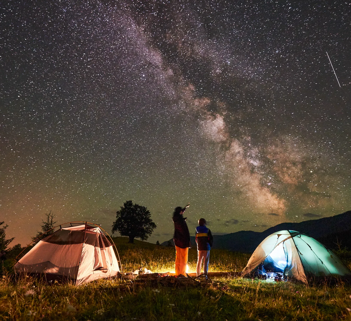
The wooden deck is a weird element to bring into it. In the US decks are sometimes there for conservancy reasons. They’re present along parts of the Appalachian trail.
I might instead draw the line based on whether members of your party are putting it up and taking it down as part of the trip.
But I could also see electricity being a reasonable dividing line. Like a cabin several miles from where you can get a motorized vehicle might be more camping than a tent in your backyard that you ran an extension cord and a TV out to.
I’m ok with others drawing lines elsewhere though.
I tear up at most movies. It’s not a sad movie, but Everything Everywhere All at Once holds the current record for most cries.
Generally if a movie doesn’t make me tear up at least once that’s a bad sign. At the same time I don’t gravitate towards tearjerkers, they can feel emotionally manipulative and heavy handed.
I almost never cry for TV shows or books.

I liked them. The arc of the first two is over. You get more details about the Shrike, but if you’ve gone years without reading further, I can’t imagine it’s that pressing.
If you reach a point where you’re looking for sci fi, and don’t have another obvious choice, go for it you’ll probably like them. But I wouldn’t recommend shifting them above anything in your backlog. Hyperion and Fall off Hyperion really are the stars here.
Fall of Hyperion is a good stopping point. I liked 3 and 4 as well, but they’re doing their own thing. I tend to think of it as two separate pairs rather than as a single 4 book series.

I can’t really visualize things in general. Due to that, if you tell me it’s muddy that’s most of the information I get. My brain won’t automatically try to put mud on the horses or add other details.
Here the specifics help a lot and I have a better sense of the muddy day for it.

AI aside, different voices may be immersion breaking. I tend to avoid audiobooks with more than a single narrator.
You’ll love TV advertising schedules. You can buy slots all the way up through 29:59:59
Or just start ordinals with 0th for years 0-99
This is standard in US-style carrot cakes
You should’ve posted the whole article, it was an interesting read

When combined with other data on the same line and written without the slash, it usually won’t mean not applicable.
If it’s in some sort of published professional context, I wouldn’t read it as not applicable without the slash.
North America is a reasonable guess when specifying region could be context appropriate. Like you said with video game team names, but also company/org names, species common names, or treaties.

Both halves open externally. But I’m still getting thumbnails, not the pair of buttons.
Inline images also don’t load. I’m definitely not complaining about that. Ideally I’d want alt text to load, with the option to expand to image. I’ll happily take a bug preventing loading over Lemmy’s default.
It’s not simply a reading comprehension thing with bullet points. If your questions require research on my end having them already structured in bullets does a few things to help with that process.
The asker’s bullet structure gives something to mimic. You can even put your answers directly below the question, so the asker can be reminded of their own questions.
The bullets also help skimming, if I need to see which item id is needed next it’s easier to do so without losing my place.
Bullet grammar structure also allows for much terser sentences. If I need to reread your question it’s easier if I don’t have to ignore a bunch of words that don’t substantively alter the meaning.
Do I need any of these? No. Could I put the questions into bullets myself for the reply? Sure. But it’s easier to spend more time and effort on answering your questions if you save me a few steps.

You don’t give up your right to vote by moving abroad. Your vote in state and local politics is lost. How much of a real impact that has depends on where you live.
This assumes voting continues to function more or less as it has in the past.
We also check to see if the word that popped into our heads actually rhymes by saying it out loud. Actual validation steps we can take is a bigger difference than being a little more robust.
We also have non-list based methods like breaking the word down into smaller chunks to try to build up hopefully more novel rhymes. I imagine professionals have even more tools, given the complexity of more modern rhyme schemes.
Rubbery texture sounds like it could be solved by different cooking techniques. Small changes to how eggs are cooked can make a lot of different textures.


That will work in some regions. In others you may need to rent a bear canister. Talk to your local rangers to find out what’s appropriate, it depends on the local bears.