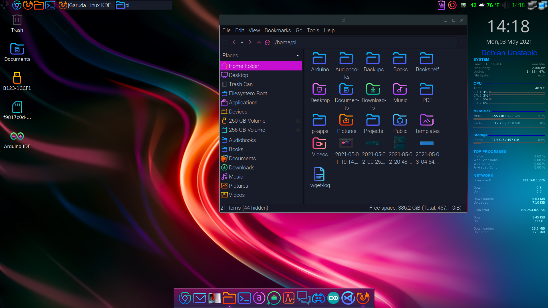
I mean to each their own obviously, but I cannot stand the Sweet KDE color and icon theme which does most of the work of styling Garuda Linux. To me it’s gaudy and distracting. It appears to be pretty popular though.
Yeah, not a fan at all of this article trying to sell this as the most beautiful desktop (even after deducting the usual clickbait).
It has a consistent aesthetic that’s not bog standard. So, sure, some will find this absolutely beautiful, but as you said, it’s very much a matter of taste. And probably most users need/want something more discreet than that.Right, when I saw this line I knew the author and I look for completely different things from our desktop environments:
I’ve long considered KDE to be too standard an affair for my taste.
And that’s fine. I’m glad the flexibility to satisfy both of us is available on linux.
Yeah, that sentence irked me a lot, too. The only thing that’s somewhat ‘standard’ about KDE is the default setup. And sticking to the default setup isn’t really the point of KDE.
Obviously, you can, if you like it. But if you don’t, then it’s like not wanting some building block set, because you don’t like the way they put those building blocks together in the advertisement.
I don’t know why, it seems ugly and generic to me. I agree with @bilb@lemmy.ml that its color and icon theme is very distracting, and personally it’s inconsistent. I mean, why would I need a different color for each folder in my home folder?

This is on LXDE, not KDE.


