A Material-looking mobile optimized UI for Mastodon/Pleroma which follows the Google+ look. The last commit was 8 months ago, and the muse-ui library hasn’t been updated for 2 years, but still works and looks awesome.
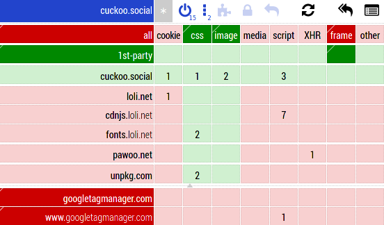
yo wtf is loli.net

That is the “dark” side of the fediverse… there is a sizable chunk of the Fediverse, mostly Japanese speaking, that circles around drawn pictures of under-aged girls (so called “lolis”). It’s mostly harmless, but a bit iffy depending on your ideological stance on the issue…
Image hosting/CDN. Pawoo.net seems more like what that other individual said, as it is an actual Japanese mastodon instance.
I wish someone would still take on the project. Unfortunately, at least for me in Edge and Opera, for example, the search no longer works at all. Unlike other interfaces, Cuckoo+'s implementation as a PWA works smoothly including push notifications. I would be really happy if someone, instead of building the hundredth Mastodon client, could fork it and bring it to life. Because this is a client that I really would like to recommend to the non-techie-friends to get into Mastodon. Besides tooot, which is just as great, but only available on mobile.


