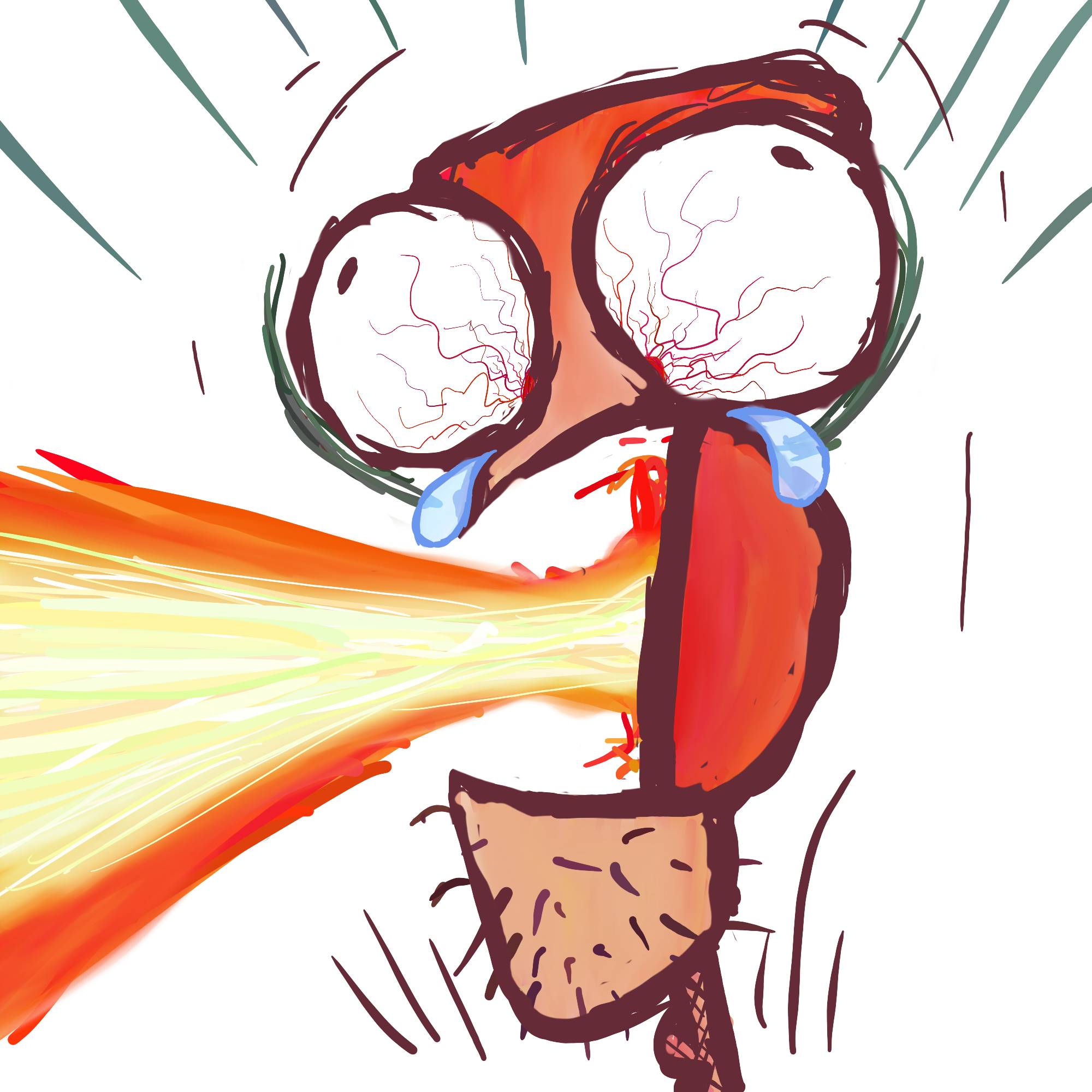
Used a reference to help with the background and tried to make it match the character. Critiques?
You must log in or # to comment.
Overall great artwork. Love the sense of depth. One thing I’d like to critique are the small branches which feel just too curly to me. Not sure how valid my critique is since I have no idea what your reference was
Damn, you’re right. And that’s not how they look in the reference and I missed it. Thank you!!


