
cool graphic, but why did they decide to make the tall peaks the same color as the “too small for the scale” areas?
What’s going on with the top of the map?
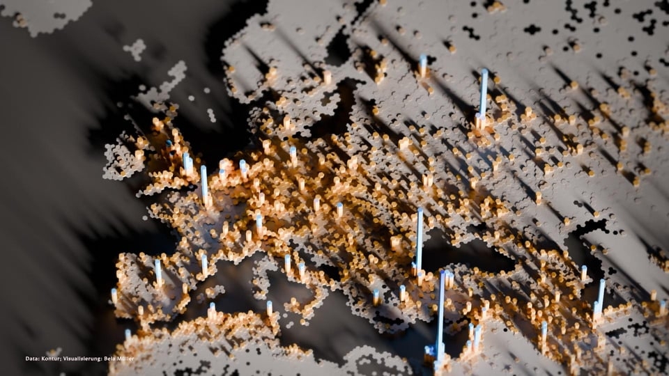
The long ‘island’ north of Iceland and the long island to the left are probably the inhabited parts of Greenland. The north of Canada and the North of Russia seem to be very sparsely populated, too. So are the arid regions of Africa and Saudi-Arabia. According to my interpretation of this map.
What’s with the ugana population?
This is so cool. Istanbul is clearly visible and is that Gaza to the south-east?
After looking closely at the cropped image found on reddit, I think the southward pointing notch (‘bay’) of the Mediterranean is in fact part of the Sahara desert. The blue area next to that then is the Nile delta with the tall peak, Cairo. Palestine then starts next to the dark corner on the right from it.
Ahhh, yeah, that makes so much more sense!
Its quite misleading that regions with (almost) no inhabitants have the same colour as the open sea (although, technically, there are also no people living).
Haha, I had the exact train of thoughts as well: “That makes no sense! Unless …”
I was wondering why there were these big lakes in the Sahara 🤦♀️
Me too… I also bet some Canadian would wonder why large areas of his country have dissolved.
deleted by creator
