
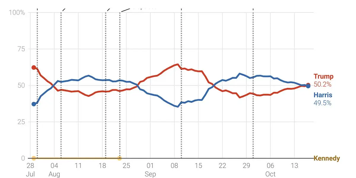
Nate Silver’s polling tracker now has Trump slightly favored to win (50.2%) the election. While this shift appears small, it has drawn attention because it pushes Trump just past the halfway mark in forecasts for winning the Electoral College.
Silver explains that while Trump’s rise over recent weeks is significant, and his polling model, is designed to minimize overreactions to new data to provide more accurate long-term predictions (i.e., it’s likely a “real” effect), this doesn’t in any way mean Trump “will” win, and the race remains highly competitive, especially in key states like Michigan, Wisconsin, and Pennsylvania, which are critical to determining the outcome.
Polls don’t just keep asking the same people — they sample different groups to reflect the broader electorate, which is constantly evolving. People change their minds based on new information, campaign events, and media coverage. Suggesting that the graph isn’t “realistic” because it shows fluctuations is naive. Voters aren’t locked into their decisions months in advance, and it’s ridiculous to expect a smooth, static line. Polling is supposed to capture the fluid nature of public opinion. The fact that you think a realistic graph shouldn’t show this ebb and flow shows a complete misunderstanding of both polling methods and voter behavior. The defined patterns you’re questioning are exactly what you should expect in a competitive, dynamic election.
You misunderstood my comment. My exact problem with the graph is that its 2 mirrored lines. You’re right people change their minds all the time. The data from the graph suggests that as 1 person shifted to from trump, they went to Kamala and vice versa. That wouldn’t be the case unless they polled the same group of people over the year.
A trend of the same sample of people is meaningless over the course of a year. All this graph shows is this group of people are undecided voters and will continue to be undecided going into November.
Edit: didn’t realize this graph is a model and doesn’t reflect any polling. It’s a meaningless graph.
Your response shows that you’re still fundamentally misunderstanding how polling models and graphs work. The mirrored lines don’t imply that the exact same people are shifting back and forth between Trump and Harris. Polling aggregates track the broader electorate, not individuals, and as different groups are polled, the graph reflects overall trends in public sentiment. It’s not about a fixed sample of people being tracked throughout the year.
When one candidate rises while the other falls, it doesn’t mean voters are just switching between the two in a perfect one-to-one ratio—it shows that overall support for each candidate is fluctuating as a result of multiple factors, including undecided voters making up their minds, shifts in enthusiasm, and reactions to campaign events. You seem to be imagining this graph as a static sample over time, but it’s capturing a much larger and more fluid electorate. Reducing it to just a few undecided voters misses the entire point of tracking these dynamics across the country.
Claiming that this graph “just shows undecided voters” is a massive oversimplification and shows a lack of understanding about how public opinion tracking works. This isn’t about a small group flipping back and forth; it’s about broader shifts in voter sentiment that polling aggregates are designed to capture.
The lines don’t show popular vote, but chance to win. And either Trump or Harris is going to win, so p(Harris) = 1 - p(Trump). The lines must mirror each other. Since polls always have uncertainties and current events influence voting behaviors, of course the exact percentages fluctuate.