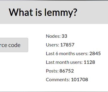
From the-federation.info:

There is also lemmy-stats-crawler:
"crawled_instances": 18,
"failed_instances": 7,
"total_users": 17671,
"total_online_users": 118,
From the-federation.info:

There is also lemmy-stats-crawler:
"crawled_instances": 18,
"failed_instances": 7,
"total_users": 17671,
"total_online_users": 118,
imo the UI feels much cleaner than the new reddit UI and much more modern that the old reddit UI. I would like to be see some kind of compact mode though, especially for mobile.
I’m def up for seeing ideas / ways I could tweak the layout to make it more clean and compact. I’m not really a UI person, outside of just copying the styles of my favorite apps… like this UI is modeled mostly after boost for reddit.
I mainly use redreader for Reddit, I don’t think I have ever used boost. I like it and find it easy/simple to use.
It has a main menu, where you can select the community.
Here is what it looks like.
Main menu/front page:
R/all:
R/Linux
Hamburger menu options:
Sort menu options:
i’m sure you could fork the source code and adapt it to lemmy :)
saidit did this and it looks like it would be simple.
I have never thought about this, but now that you mention it, I could see a compact mode being a nice addition. Yeah, I think you are right. I have no problems whatsoever with the current mode, but there is a lot of free space around that could be potentially shrunken for a pretty compact UI.
Have a look at my comment here that shows what the redreader app looks like. It is a compact Reddit app: https://lemmy.ml/post/83539/comment/83464
Thanks for the heads-up. Yes, that is exactly what I am talking about. Would be nice to have an option to have something compact like this.