I was using the Nova launcher forever, but it’s been getting buggier and buggier and support just blames android. plus I understand there are privacy concerns about them these days
I switched to hyperion, and it works just fine except for one feature, and I can’t get support to respond anywhere for any reason.
which launcher do you use, and why do you like it?
Nova Launcher got bought by a data mining company a couple years ago. I left and went to Total Launcher. It is a little weird at first the way it works, but it is now my full time launcher.
I like it for the over lapping widgets that can be sized down to the pixel. It also has a bunch of built in widgets like icon widgets and allowing widgets to stick in place across home pages.
I like KISS, because it’s different.
I have it set up with a blank screen, with a small number of pinned apps. So my home screen is a search bar at the bottom with 5 or so small icons above it.
When I tap the search bar, it shows me my most used apps. I can search for anything else, and choose to view the whole list if I want. You can also web search from it a bit like the Google one but without the data harvesting.
I also use gestures. A swipe left, right, up, or down on the home screen opens various apps for quick access.
Previously I used PieLauncher which was even more different.
Neo-Launcher (you can find it on GitHub) is attempting to replace Nova.
They’ve done a decent job.
Niagara. i pay the yearly subscription for it. but it’s not for everyone
I switched to Niagara too, gotta say it’s really great. I can’t imagine using something else now
what does it do for you that others don’t
I use it but I can’t answer that question. It just makes everything seem quick and minimal. I get straight to my apps with no real thought.
I paid for Pro too.
it’s really just the best minimalist launcher i could find that still looked good, could be personalized, and didn’t limit me too much . i use the Panels app with it for more quick shortcuts that don’t fit on the home page, since there’s a limit. but the paid version lets you make pop-up folders for apps too.
What is the amount of the yearly subscription and what don’t you get with the free version that promoted you to get something you had to pay for?
I am not trolling, just can’t find info on it and don’t want to check it out if some reliant features are behind a paywall.
it’s 3.99 a year. the description of the Pro version benefits are listed:
Niagara Pro is the premium in-app upgrade to unlock all of the app’s features.Benefits of upgrading to the paid version:
- Pop-up widgets: Get timely information at a glance
- App list pop-ups: Add folder pop-ups to organize all your apps
- App pop-ups: Swiftly access related apps, shortcuts, or widgets
- Ad-free experience
I’d say i use all the paid features all the time. i also prefer this launcher because I’m ADHD af and it helps keep things looking clean and there’s less distraction. my favorite things about this launcher are the weather widget and calendar agenda built into the home screen
I am also ADHD so you may have sold me on it.
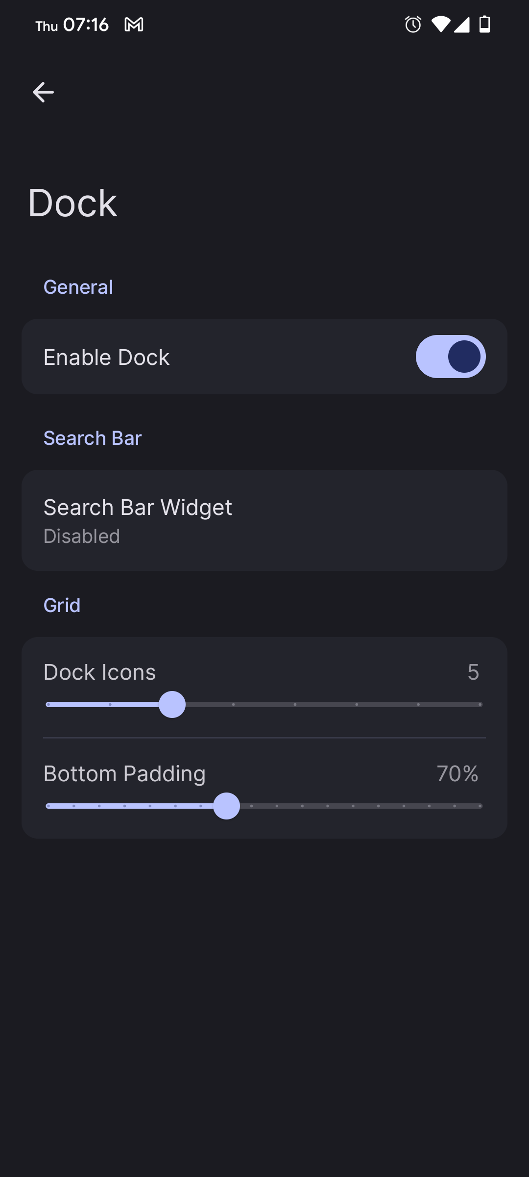
Lawnchair. Because I can remove the search bar and add a widget for my favorite search provider.
how do I remove the search bar? I can’t find it
Lawnchair has a lot of different versions and releases in different locations (GitHub, play store, f-droid all different). I use version 14 dev release and it’s under Dock section of settings:

If you don’t mind some self promotion–I use Mere Launcher. I created it to be minimalist and functional, but also still look nice. I also designed it with accessibility in mind–specifically for folks who don’t like swipe gestures as much. If you’re looking for something simple, give it a try.
I switched to Kvaesitso from Nova. It takes a lot of getting used to because it does most stuff differently, but I’m finding it light, efficient and functional.
I have used kvaesitso for a long time now, stopped my launcher-jumping.
I’ve been using Lunar for the last few months and I really like it.
Strips back your home screen and app drawer to a very minimal appearance. I find it has helped me to use my phone less, I use it when I want to use it but I don’t find myself in this dopamine hunt mode anymore.
Its also FOSS which is a bonus.
KISS: Search based and Fast
It was Nova Launcher, but they got bought out by an ad company, so now I just use the default launcher. You can’t trust any company these days.
Used Nova for a long, long time. Would still be using it now, had I not made the mistake of switching to iPhone for the first time in many years. On my tablets however, I use Smart Launcher.
Nova was bought out by an advertising company, so they’re tracking and selling all of your activity now.
Can we get some sourced links on this outside of “Branch is bad”?
As far as I know many apps use it and while Neo Launcher has seen me right, the woo har about Nova being Satan seems odd in the context of your reply.
Cheers.
Yes you can. There are plenty available.
neo launcher. feels similar to nova, but Foss. still work to be done, but over all I like it
Action Launcher is very customizable.
I just loaded it and the first thing it let me do was delete the fucking Google search from my home screen, I’m already in love
I have a number of preferred launchers, I rotate between them. Nova, smart, Niagara, Microsoft. Right now I’m on smart.
Smart launcher. Because it has automatic app categories and supports smart gestures and is a nice replacement for Nova launcher.
I also like Niagara launcher for its smoothness and fast search based app launch


