
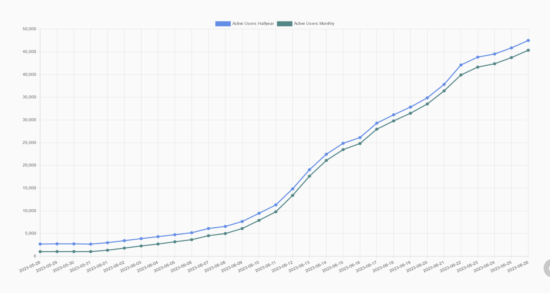
From 3000 daily active users on June 1, 2023 to 47500 on June 26, 2023.
According to Lemmy’s documentation, “An active user is someone who has posted or commented on our instance or community within the last given time frame.”
Sources:
- https://lemmy.fediverse.observer/dailystats&days=30
- https://join-lemmy.org/docs/contributors/07-ranking-algo.html
EDIT: check out this link for a list of lemmy apps: https://lemmy.world/post/465785
Yeah… It’s ugly. The dark red theme is the best IMO. But comments now look a lot more slick in v18, and the Thunder app is looking like the one to beat.