
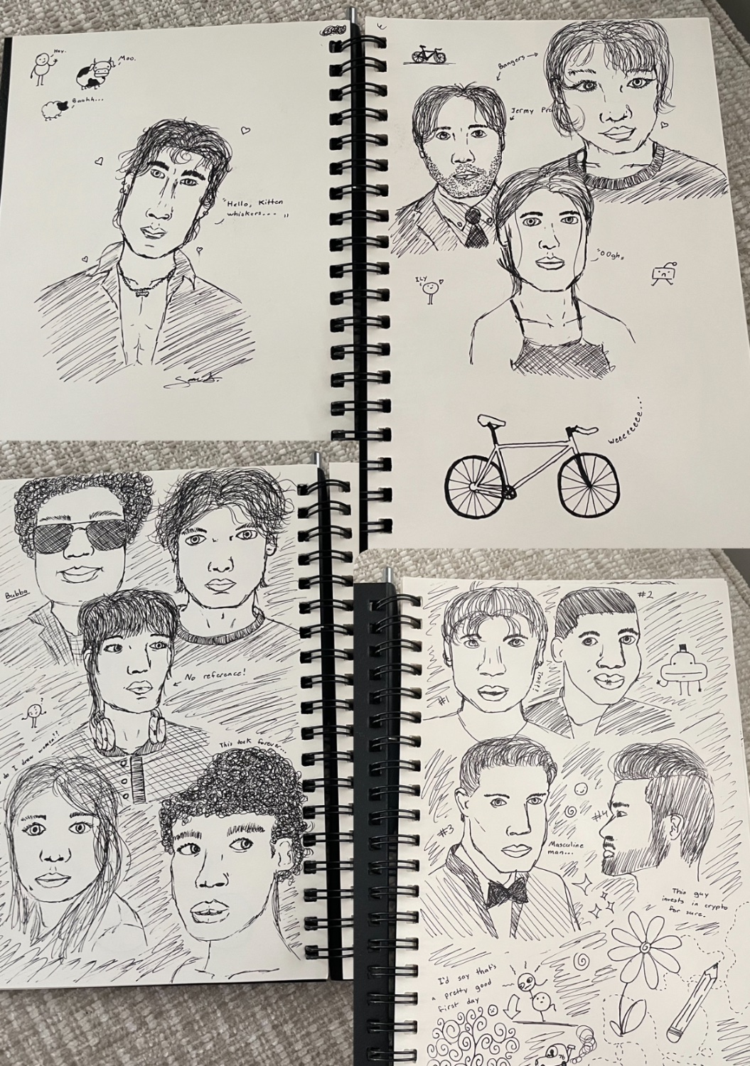
While that one guy with the tall head was intentionally silly, I think I’m struggling most with proportions. I’m using a reference image for most of these, but none of the end results look much like the people in the photos. I’m also not using a grid as I’m doing this all with pen. I know I’ll eventually get it with practice, but is there anything specific I could try?
First off, these look great as first drawings!
Now if you’re looking for more realism, one piece of advice I have for you is change the position of the eyes. They don’t seem like it but they’re just about halfway on someone’s face.
Either way, you’ve got a cool style so keep at it!
Edit: I would also totally get a tattoo of the little guy in the top hat waving hello
Thanks! And yeah, they definitely don’t seem like they’re half way, lol, so that’s good to know. Another commenter suggested the Loomis method, so that should help me place things better.
I always drew the top hat guy as a kid, so I thought I’d try doing a modern rendering. I quite like him, too. :)