I miss all those things. 😭
even the clock??
It annoys me that this post is even a thing that makes sense. The clock position is defined in software, and I’d be surprised, if it’s not already implemented, so that it can be moved with just a different configuration value. But that configuration is decided by the manufacturer and not exposed to the user.
So, even though it should be trivial to move that clock on any Android phone, it’s not. You’re bound by the decision of the manufacturer, unless you take more drastic measures, i.e. flashing a Custom ROM.
On Samsung devices you can move the clock back to the right with Good Lock
That’s how I restored the true state of my Android!

This is how it is on my Xiaomi Mi 11T. The orange line is about where the front camera is placed.
Both the clock and the network rates are on the left. With recurring alarms, the alarm notification is always there for me. Besides these, only 2-3 icon slots left for notifications (camera circle takes horizontally larger space than the orange line), while on the right there is always enough space for both the clock and network rates, which would open about 5-6 slots for notification icons, which in turn would more than double the amount of notifications I would notice there.
Did the clock move for folks? My A5 is almost 10 years old now, so I’m out of the loop re android developments in this decade :p
I think, it came about since so many phones now have a camera notch in the middle of the screen up there. Not having the clock on the right, makes it so those icons on the right don’t reach underneath the camera notch…
Oh fucking gross
Clock got moved to the left in AOSP 9
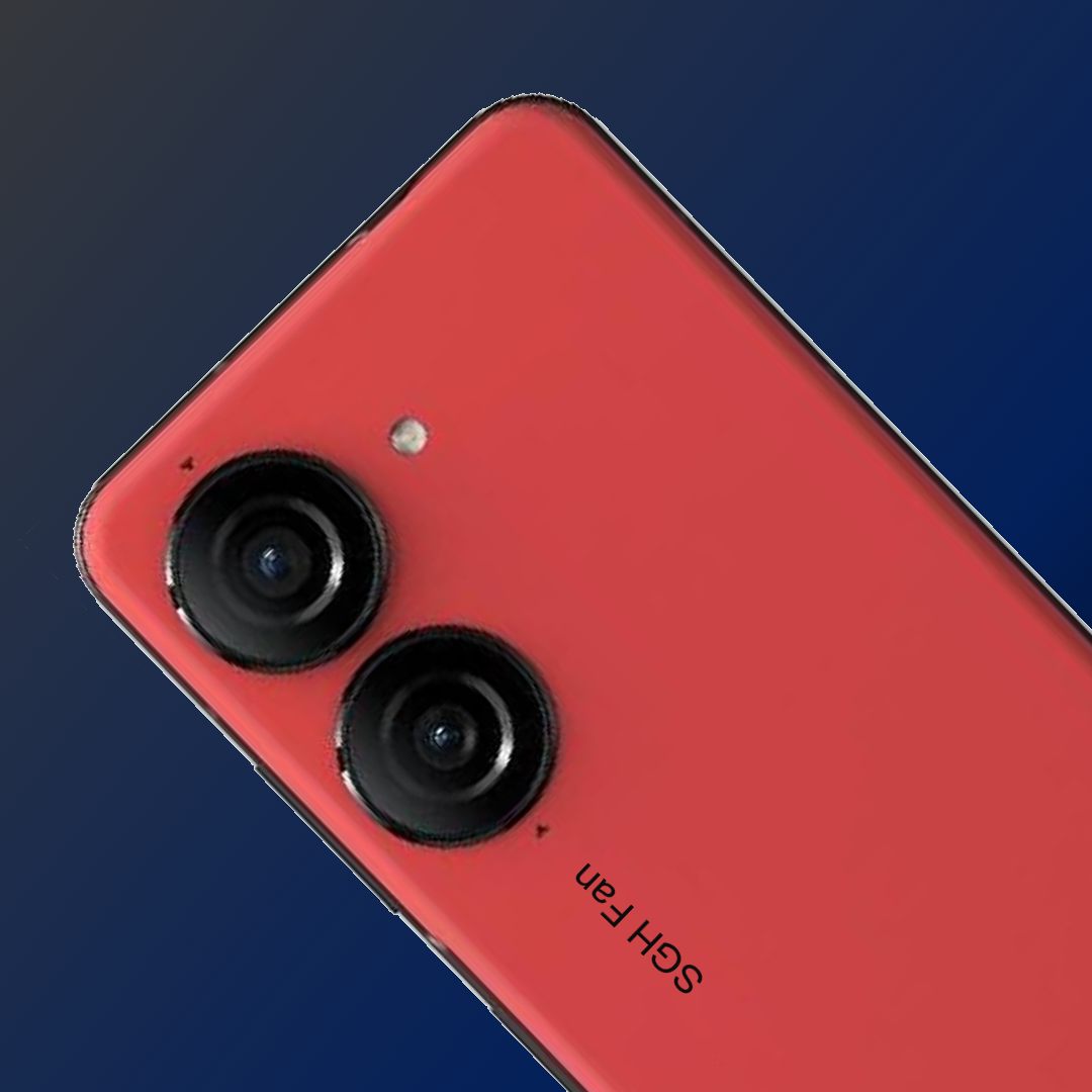
I wish my Zenfone was like this! Punch on the left, everything else on the right. Also, allow me to view seconds there!
deleted by creator


