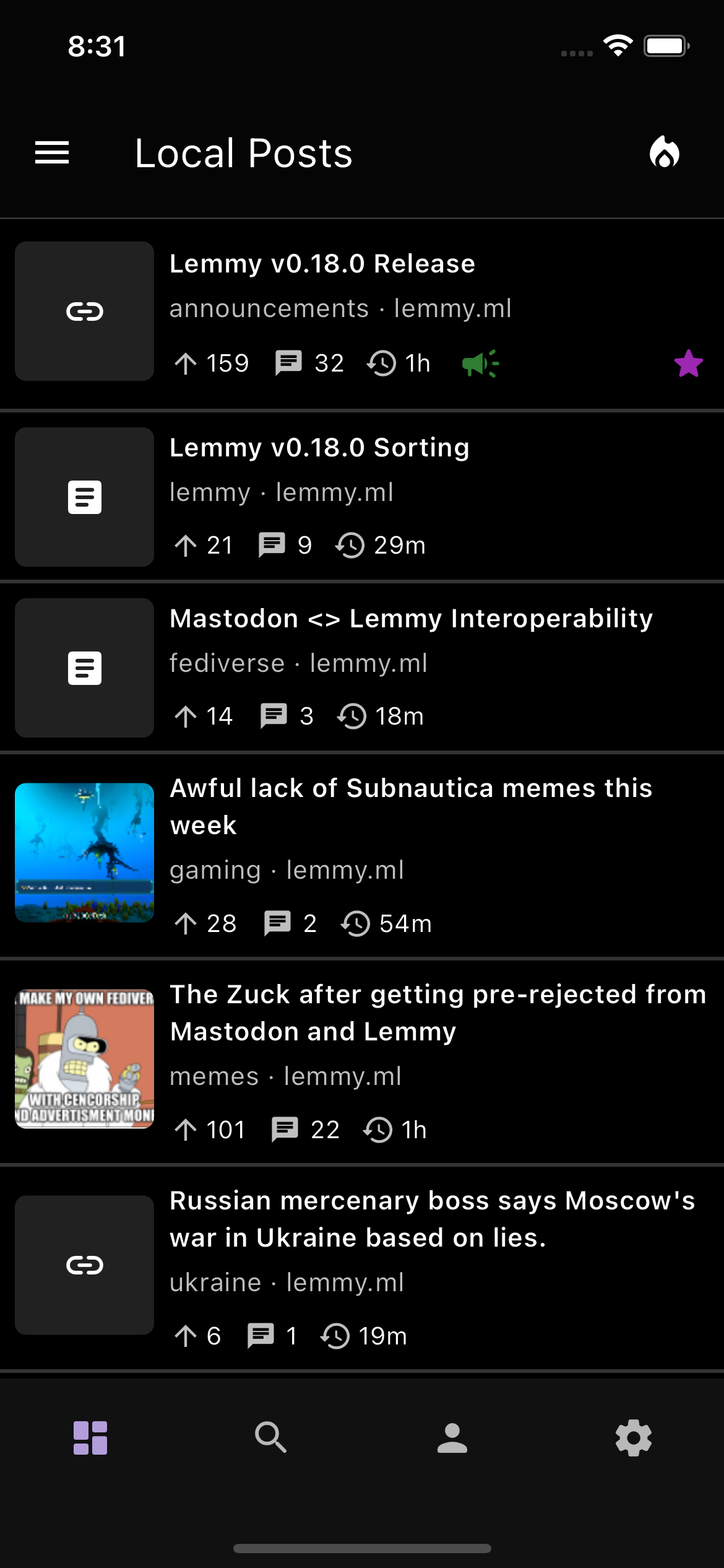
Sneak preview of OLED Black theme, and also a more compact view for those who were requesting these two features!

+1 for compact view :)
Any plans for font size options?
Thanks! There’s still a bit more testing to be done, but I think it looks pretty nice
There’s nothing yet for font sizes as of right now, but definitely something to think about in a future release. Right now, the font sizes should follow what you set in your system settings!
Looks epic, will it be ready in the next update?
I love the compact look! Feels like you’re showing just the right amount of info here. My two questions/thoughts:
- How does voting work in that view? (I’ll admit I haven’t logged in to Thunder yet so I’m not sure how voting works in-feed using the default view, if that’s possible)
- could there be an option to put the thumbnails on the right side?
Honestly I really like Jerboa’s list view with the voting arrows on the left, but your compact view looks even classier since you iconified a few things that they currently represent with words. Excited to try this once it’s been implemented!


