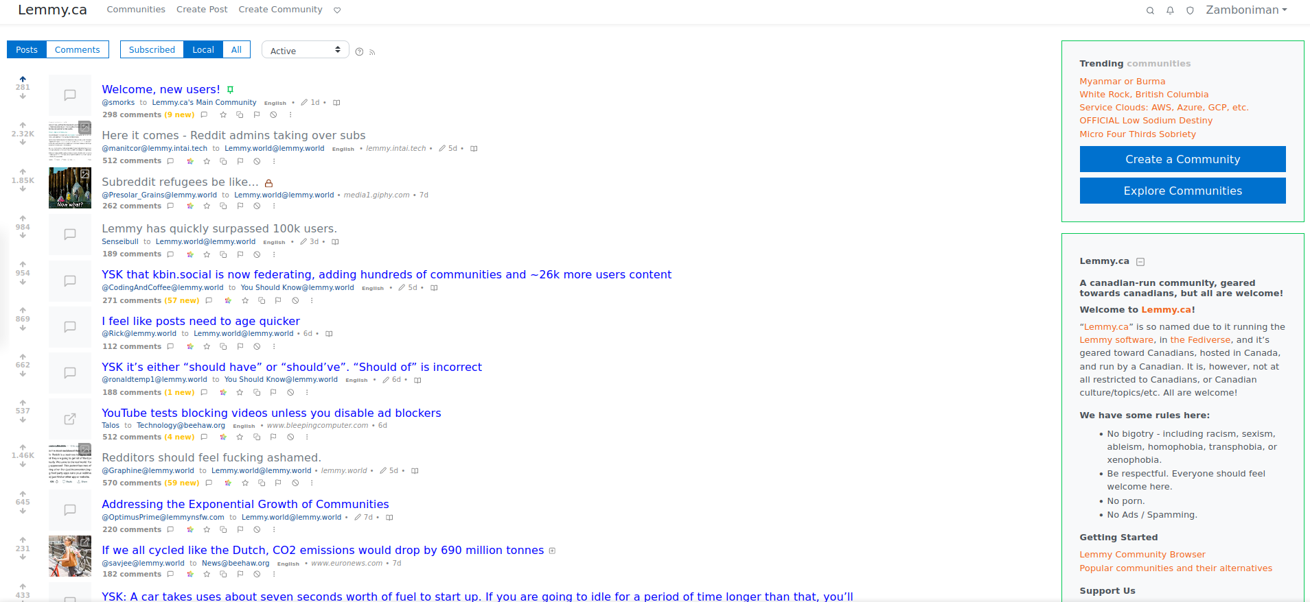
I came across this one on userstyles.world and didn’t see it referenced here. It’s probably the most ‘old reddit’ looking of all of the one’s I’ve seen so far.

I came across this one on userstyles.world and didn’t see it referenced here. It’s probably the most ‘old reddit’ looking of all of the one’s I’ve seen so far.

Use Dark Reader!
Already tried it before commenting, in all settings I could and they all look pretty bad. Default one has dark blue links for some reason. Weird.
Fiddling with the contrast/saturation might help? I’ll mess with it another time, I’m on Jerboa right now
I’d tinker with it but too busy with dev work to do more dev on the side right now. Maybe later when I’m done. I hope I can find time in July/August to build tools for Lemmy.
I’m on mobile kiwi browser PWA right now. Works pretty well.