You must log in or register to comment.
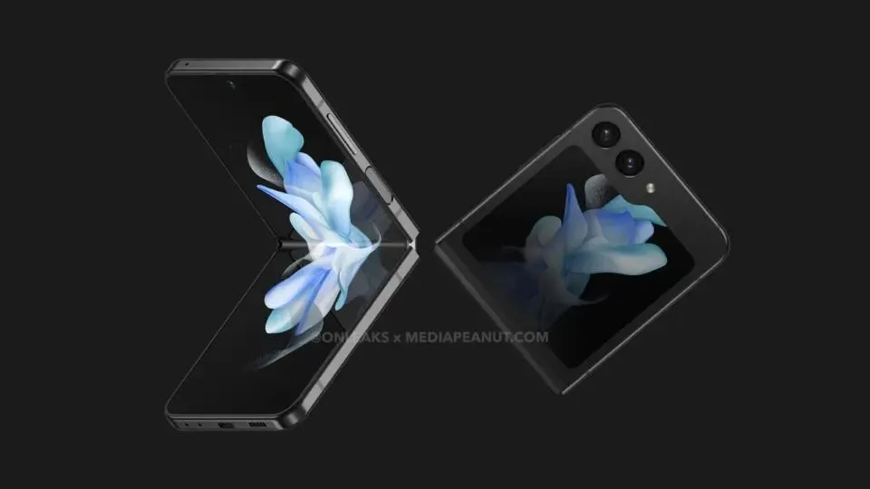
I’d prefer it to have the Motorola RAZR cover screen. This one looks like a Windows folder 🤷🏻♂️
The cameras on the Razr+ block too much of the screen for me
But yeah, would prefer just a flat line at the bottom.
Honestly I don’t want a big cover screen but it seems like we’re going away from that
Does it block the screen when its technically giving you more screen? Plus the RAZR+ offers a mode to turn the bottom half black essentially hiding the lenses.


