
This is by far the most user friendly map of a museum I have ever seen. Out of the big four I’m visiting soon, the V&A’s map is terrible, the Science Museum’s is more like an ad brochure, and the British Museum’s is okay.
This one? Perfection. Color coded, vector graphic icons to highlight what kind of things are there, and a great parallax? viewing angle so the location of other floors and their stair and elevator connections are obvious. And the best part is that it all fits on one page.
You must log in or register to comment.
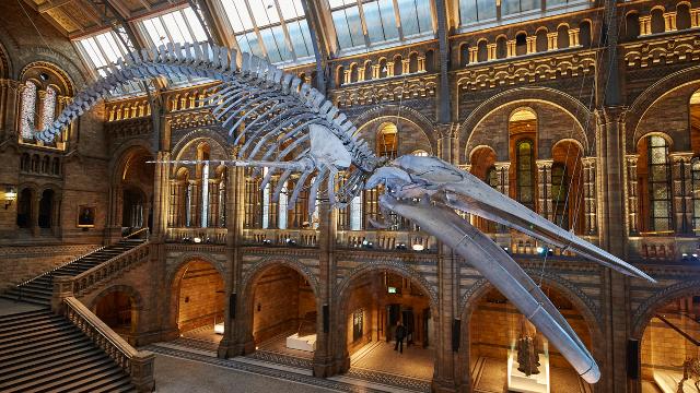
Followup: So the giant whale skeleton is actually in Hintze Hall and not where the whale icon is on the map, which caused us a fair amount of confusion. But besides that, basically perfect.