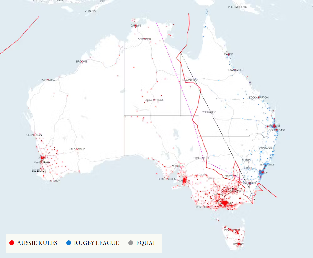
Because the image itself doesn’t have an explanation of the lines, here it is from the article:
This takes [a map of towns coloured by whether Aussie Rules or Rugby League is more popular] and draws a (red) line along the boundaries between the two codes. Have added Turner’s original description (pink) and the line as it’s most commonly drawn (black) as dotted lines to see how they compare, as well as the plaque meant to mark part of the line near the towns of Corowa (NSW) and Wahgunyah (VIC). The line to the west shows the divide between WA and the Cocos (Keeling) & Christmas islands.
The plaque mentioned is the small black square on the border between Vic and NSW, quite a way south of any of the lines.
Also, that map of towns coloured by which is more popular seems to be seriously flawed. The colours and cells on the map may or may not be correct, but the labels it shows when you hover over it are hilariously wrong. I hovered over a cell that covers The Entrance at Tuggerah Lake on the NSW Central Coast. That cell was red, surrounded by a bunch of blue cells. It told me this was Julia Creek, Qld, and that rugby league was the more popular sport.
I saw blue way off in the northwest around Christmas Island, which it told me was Charlsetown, NSW. I’m actually in St Lucia, Qld, where both clubs are equal, but on that map it tells me I’m in blue Tocumwal, NSW, where Aussie rules is more popular.
This problem was introduced somehow between the map of The Regions and the map of The Regions (with towns where both codes were equal removed), because the former is correct in the few I checked.
Because the image itself doesn’t have an explanation of the lines, here it is from the article:
The plaque mentioned is the small black square on the border between Vic and NSW, quite a way south of any of the lines.
Also, that map of towns coloured by which is more popular seems to be seriously flawed. The colours and cells on the map may or may not be correct, but the labels it shows when you hover over it are hilariously wrong. I hovered over a cell that covers The Entrance at Tuggerah Lake on the NSW Central Coast. That cell was red, surrounded by a bunch of blue cells. It told me this was Julia Creek, Qld, and that rugby league was the more popular sport.
I saw blue way off in the northwest around Christmas Island, which it told me was Charlsetown, NSW. I’m actually in St Lucia, Qld, where both clubs are equal, but on that map it tells me I’m in blue Tocumwal, NSW, where Aussie rules is more popular.
This problem was introduced somehow between the map of The Regions and the map of The Regions (with towns where both codes were equal removed), because the former is correct in the few I checked.