Edit 18/12: I updated the proposition, based on u/SomeAmateur remarks.
What do you think? Feel free to comment, even if it is to point out the things you don’t like, or that you don’t like this proposition at all and prefer the old one. I’m no logo designer, I can promise you won’t hurt my feelings ;)
Original post:
Since 2025 is getting closer I thought it might be a good opportunity to change the banner and the icon.
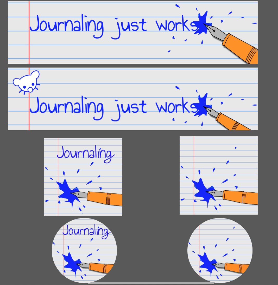
Here is a quick mock-up to promote something a tad less… serious.

There are two versions of the banner, one with and one without our dear Lemmy. And two versions of the community icon too, one with and one without the name in their default square shape and as a circular icon too, so you can get a better idea what they would look like.
What do you think? Is there one you prefer? Do they both suck, and the banners too?


Good to know, thx.
It’s certainly not the most important, it is even less so knowing some users don’t even see it.
Let’s say it’s some sort of early new year resolution. I’m a patient guy, so I i’m fine with keeping at it for awhile but it’s still just an attempt at hopefully encouraging enough people to participate in the group so that I don’t have to keep spamming content myself :p
Will see how it goes, if it goes anywhere.
Thx again four your feedback!