

Tools:
- Microsoft Excel
- Python
- R
- Adobe Illustrator
Sources (viewed online July 2024):
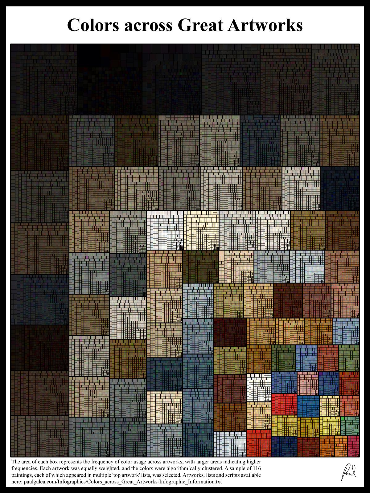
Artworks, lists and scripts available here: paulgalea.com/Infographics/Colors_across_Great_Artworks-Infographic_Information.txt
You must log in or # to comment.
How much of this is the original color fading to brown? Those art restoration videos are pretty wild to watch where they remove the oxidized and dirty top layer and reseal the painting.
This was my thought exactly. Pigments in paints fade with time, many older artworks’ paints were more unstable than today’s compounds, with many artists actually making their own paints back in the day.
We’ll never know but I’d certain that the original colors were more vibrant.
Still, this is really freaking cool.
I think that this can be explained by less important elements often taking a lot of space, but using muted colours, to direct the attention of the viewer to what matters in that work.
Gustav Klimt’s “The Kiss” is a good example of that, because he uses it recursively:

The ochre background is less vivid than the foreground (flower field and couple), so you focus on the later. As you distinguish its elements, the field (in green, yellow, violet) kind of blurs together into a muted hue, in contrast with the vivid yellow of the couple. Then as you focus on the couple, the man “wears” dark rectangles, while the woman’s dress has clusters of vivid blue and red, so you focus your attention on her.
Da Vinci’s “The Last Supper” is also a good example.

It does use plenty vibrant reds, blues, and greens (a bit hard to see as the original colours faded away), but they’re mostly for the clothes. The background takes a huge amount of space and it’s highly unsaturated, except the windows and door (right behind Jesus, to give him further chromatic focus [and the bright-dark effect]).
Fun exception that proves the rule:
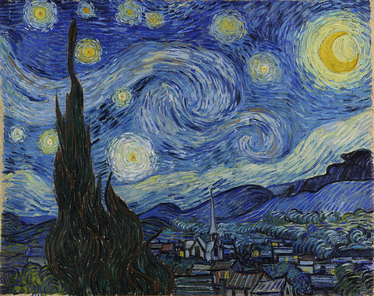
Van Gogh’s painting might look like a violation of this general “less saturated = less important” principle, but it isn’t - the name is “Starry Night” for a reason, the sky is the most important element here.
[Sorry for sperging out on this. I couldn’t help - I got painters in my family, and they’re often talking about this sort of stuff.]
deleted by creator
