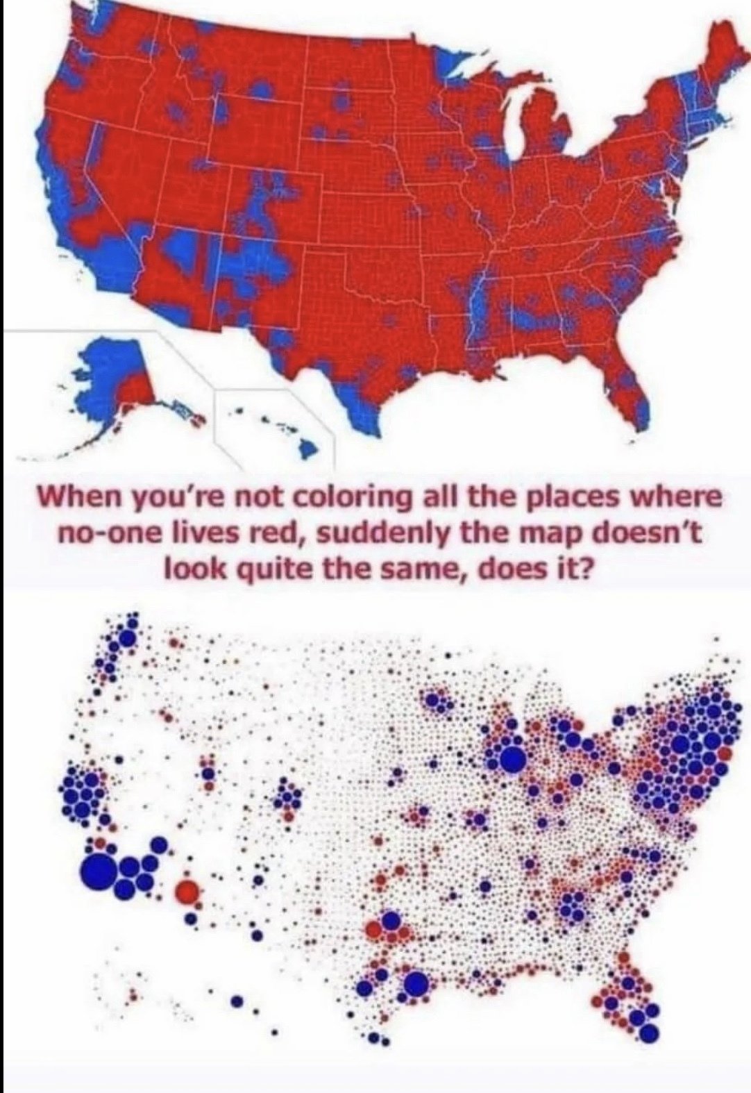
Yes, all it takes is small critical details to influence the desired reception of a presentation of data. A goal of a good map or any statistical based representation is not to operate as means of propaganda, but rather by letting the viewer decide the correlation based on making the actual data easy to understand without deceiving in an appealing way.

Yes, all it takes is small critical details to influence the desired reception of a presentation of data. A goal of a good map or any statistical based representation is not to operate as means of propaganda, but rather by letting the viewer decide the correlation based on making the actual data easy to understand without deceiving in an appealing way.