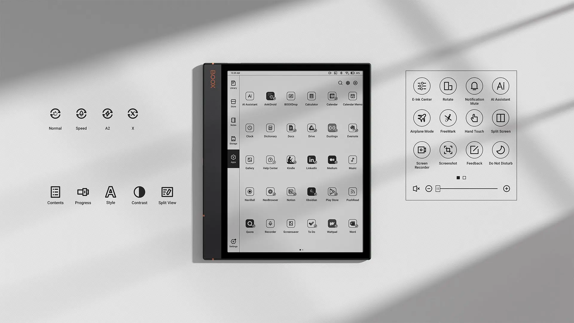
My Boox Page just got this tonight. Main new feature for me is that they added dark mode to the stock Neoreader app.
There’s a bug with the side buttons. After you long press a side button, the next short press won’t do anything. Kind of annoying.
Their “brand-new UI” isn’t much of a change. At least, I haven’t noticed any significant improvements. Toggle buttons are now rectangle, instead of the rounded pill shape, and some icons are different. I think they changed the system font, but I changed it back.
Dark Mode in Neo Reader is an improvement, except that I don’t use that app. Quickly tested it, and it doesn’t seem to invert images, so you won’t see them in dark mode. Systemwide dark mode would have been a significant UI improvement. Hopefully they’ll come up with one some day.
The best improvement I have noticed is the new anti-flicker feature. When using “speed” refresh mode (I think it’s called “balanced” on other devices), the display flickered annoyingly if there was any animation.


