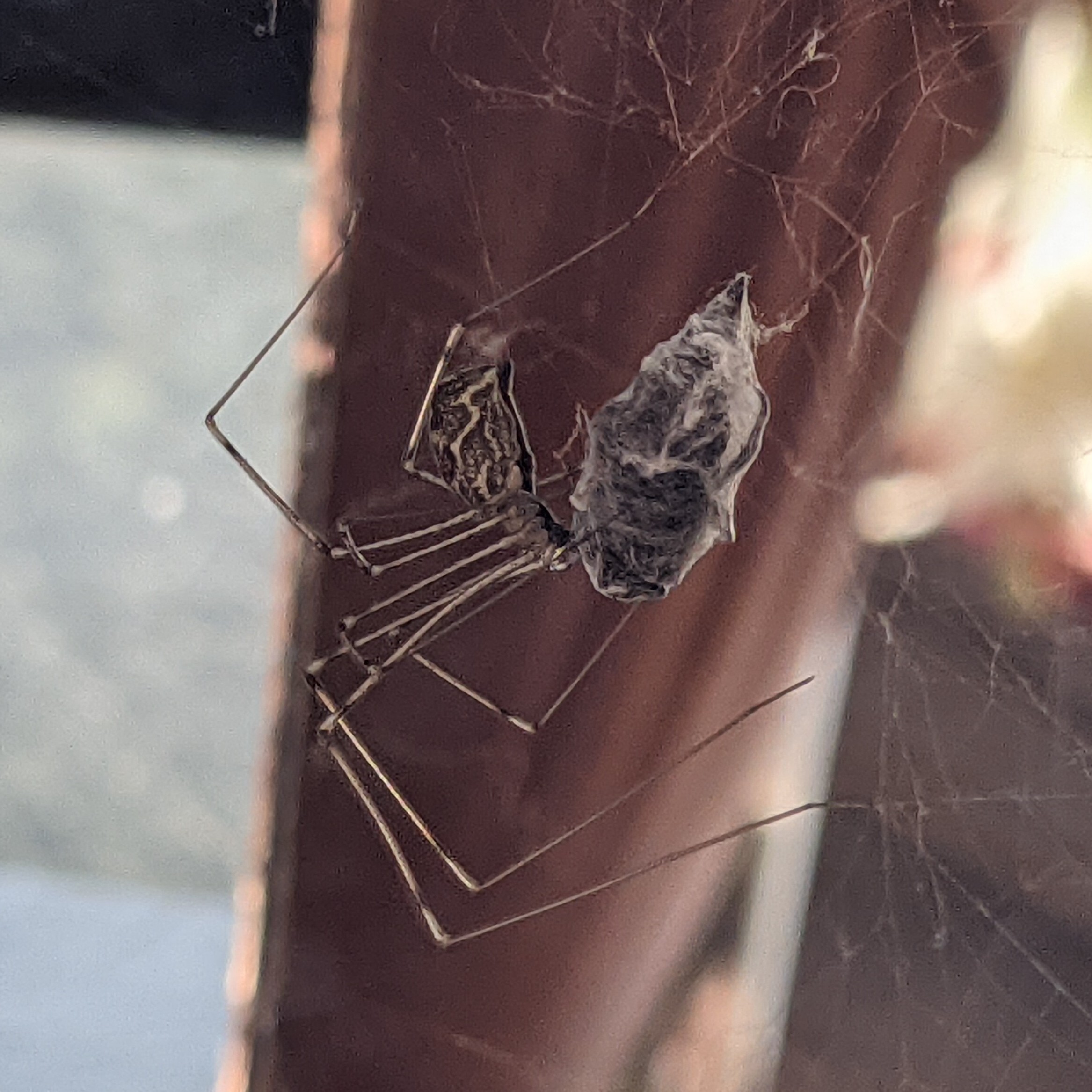
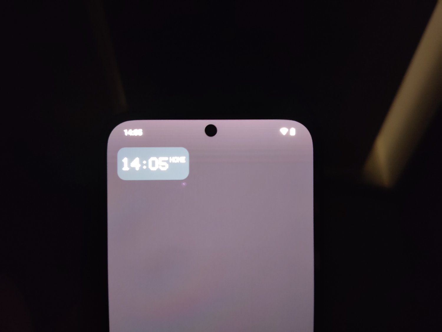
After i got my Fairphone back from the repaircenter (they thought there was something wrong with it), they told me it was an intended design. However, i see other people mention they don’t have it.
Having worked in tech, though not as familiar with phones, I want to ask a question no one else has, which may be silly of me:
It’s not a background, is it?
Haha no, it is not.
Alright… you’d be surprised how often a power button isn’t pressed, or tower/monitor is not plugged in. Sometimes the fix is the simplest possible solution.
True! And to be honest, i kinda checked it again after your comment… (With no luck)
Maybe it’s to improve notification bar visibility?
That is what Fairphone said. But then, why do i have it and others don’t? And why does this happen when i’m using a fully black wallpaper? It should be visible enough already…
@PixelOrange@lemmy.world got it mostly right from my research, though their backgrounds will still have that bar. If you use a black, or near black, background, especially one not at your native resolution, that gradient will be most noticeable. Using other backgrounds that do not have a black strip along the top you might still be able to see it if you squint.
For those of you curious: Change your background to a solid black from the background menu in settings, or grab something similar elsewhere. Then crank your brightness up. Chances are it’ll be there for you too if you’re not running a third party launcher.
I haven’t found a way to turn it off in native yet.
Yep. I’ve seen it happen in brighter backgrounds too: but instead the fade will be a little darker (it does not happen on a white only wallpaper tho…) I was afraid it was an actual “feature”, and this all kinda comfirms it. For now, a launcher will be the only “fix”.
Does the screenshot show the hue?

It does.
I don’t see the hue in the screenshot
Really? I double checked on my other phone, there it was visible as well…
It means it isn’t there. I don’t see the hue either. Which leaves, screen issue.Edit: It seems like a contrast issue? I took the screenshot and modified it contrast value -3×
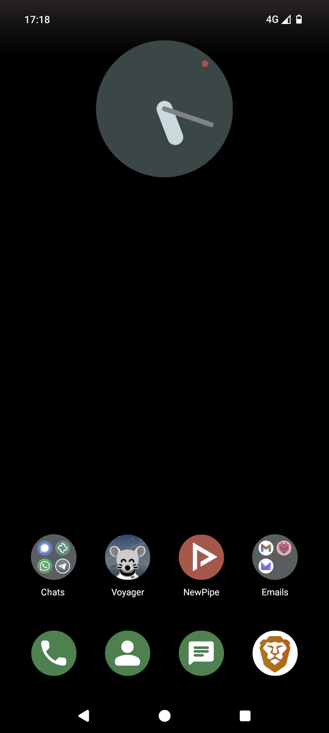
Hmm… I understand why you say that. But the thing is, my Fairphone has been send to the repaircenter for this exact reason. I got the same one back because there was no fault present in the screen or phone.
The funny thing is, the same thing happened for other people:
https://forums.androidcentral.com/threads/white-fade-at-the-top-of-home-screen.983310/page-2
Notice the guy saying: “oh, it actually shows up on a screenshot”? And i don’t see it there too. Edit: actually i do, but indeed much less then when taking a actual photo.
This is just weird man…
Yep. Already edited my comment too
Yeah it is visible, but much more subtle than on your original picture in the post.
Easier to see against the black background:
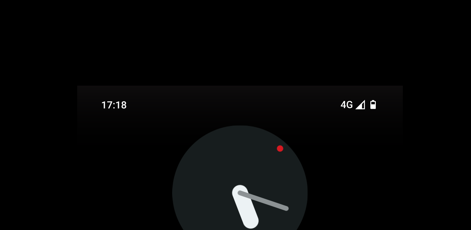
I was curious and then trying to edit the contrast, sure enough. This is 3×

Yeah, it looks way worse on my original photo, because brightness was turned on to the max. On Fairphone it is a little worse then on my Nothing phone, but not that much.
I guess I just have an ancient phone that can’t display it. I see it on the photos that people posted with the contrast turned up…but can’t see it at all on the original.
Trusty s10e finally showing its age…
I see it. At least we know it’s a software issue at least.
Let’s try to narrow down the issue. Did you try a different launcher?
Edit: Nevermind. Reading your other comments, it looks like it is the launcher.
Well, that’s nevertheless somewhat odd. Fairphone and Nothing have different stock launchers. I think they just modified the standard launcher and thus used a “feature” that was included in the first place? All things point to an actual intended design choice which can’t be changed.
I think the reason why some people see it and others don’t is because screens have variances and are not calibrated properly. This happens even in the same batch of a phone release.
I saw the gradient but I barely saw it on my Pixel 5a. I could’ve easily missed.
Seems to be an Android “Feature”
Look at this pictures, should be gone:
Edit: save them to your gallery if they dont fill the screen.


Hmm, i still notice some fade effect… Edit: same on both devices.
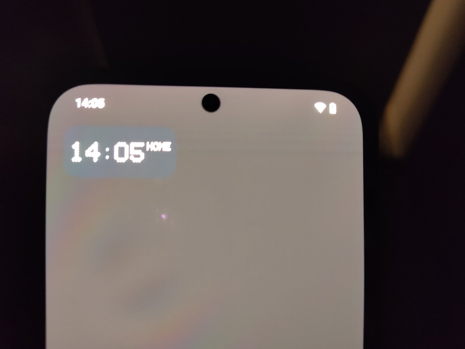
Is that your lock screen? Try to use your gallery. If its gone there, its androids “design” element.
No, i used them as backgrounds on my homescreen. In gallery the fade is not present on your images.
Do you mean the lighter parts from the top side?
Yes, the white fade on the notification panel.
I’m wondering if it would be a jab at possibly trying to help burn-in issues? Having a bit of light around the pixels of static icons and text maybe would help minimize the noticeability?
That was actually one thing i also thought! But then i thought, why only do that on the homescreen? Because even the lockscreen misses that “feature”.
Try a different launcher like Nova Launcher or Smart Launcher.
Different launcher does indeed fix the issue, but that’s such a shame because i really like the stock ones already.
So it might be that Fairphone is not aware how to make the notification bar transparent. It’s a setting in android development they can enable. (Disclaimer: I’m not a developer.)
With that in mind, they seem to be saying it was intentional to hide their lack of knowledge. It’s simply unreasonable that any developer would want such a hideous defect permanently at the top of the home screen.
On a positive note, I believe android 15 is supposed to correct this when the developer does not.
I agree. Sadly the Fairphone 5 is still running Android 13… A14 is “planned” to released this summer
Fairphone is dropping some balls when it comes to software. So much that in its current state, i can’t recommend the Fairphone 5 at all. Plenty of issues. They need to hire better developers/software designers and probably more of them too.
I’ve had contact since november, and only a few weeks ago (after i had to sent it to the repaircenter in France, i live in the Netherlands) they could tell me it was “an intentional design choice”; so the notificationbar would be more visible. I sent it to them because of the hue, because they first said; “it looks indeed suspicious”. So… Yeah…
OLED burn-in maybe?
Nope. My Nothing Phone 2a came in yesterday, and i’ve tested my Fairphone for it already.
Maybe it’s just a temporary image retention? Was there something (bright or white) previously at that section of the screen? Like some app that you use often?
Nope. Because on the lockscreen and when i slide down the notification/quick setting panel, it is just normal, oled black.
is this everywhere on the device?
Only on the homescreen
Sorry for the late reply, that shadow is present in most launchers as a default option to create contrast between the wallpaper and status icons.
Things like Nova Launcher and Lawnchair have options to disable it.
Yeah i’ve noticed it recently in Lawnchair. But thanks anyway. Terrible design choice from Google if you ask me…


