I was confused af for a bit until i looked at the character at the top of the wall. That fixed my brain.
Thank you! I thought the guy at the top was just pushing the ladder off the wall at first.
when it flipped for me I got an instant sharp migraine
Took a while to see it.
Leaving for reference: MC Escher’s “Relativity”:

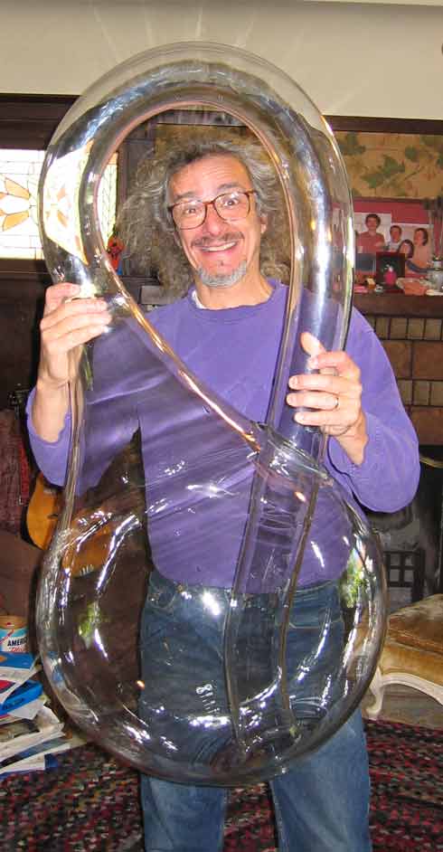
this is just like me when i’m in a klein bottle

Almost fit in this:

How you turn my world you precious thing
I think what ruins this for me is the ground. At first, the perspective of the top of the wall implies that we are below the wall, meaning it makes sense for the ground to appear as a relatively straight horizontal line. But at the end, the perspective implies that we are looking from above the wall. The shape of the wall should be visible at the bottom.
This might be fixable if the shape of the ground was extended further horizontally, instead of being just a short line where the lines meet the ground. This would make it possible to see it as a hill or edge of a moat hiding the rest of the wall which extends further downwards.
just my 2 cents, but it’s a cool idea so you get my upvote anyway :)
That because you observed the comics from bottom to top, not from top to bottom. I was never confused :-)
Even with the ground fixed, this still doesn’t work.The character turns 90 degrees, picks up the flag, and the replaces it on an already understood wall. You have to try to see the effect, as well as know to look for it.
My dude, it’s not supposed to work. That was the point of Escher’s art.
Whenever somebody says “non-euclidian” I’m like, “you mean Escheresque?”


