
Hello, there! I really like the overall feel of Thunder, and very excited to know that there’s an iOS version as well (which I have not tried yet tho).
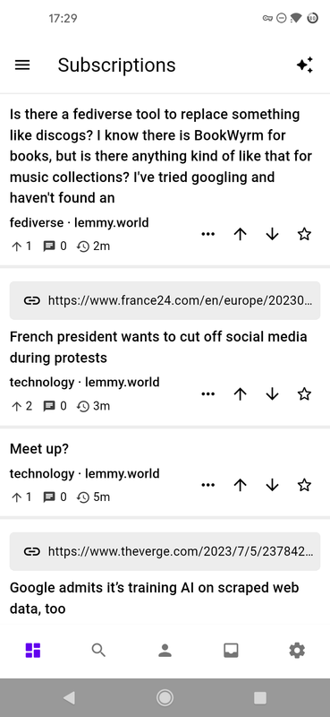
But I think some improvements can be made to the subscriptions list in general: when using either the compact or normal view, it’s pretty much plain unless the post itself has an embedded image. And it is even somewhat hard to differentiate individual cards as there is only a (thin) line separating them and the link banner is very thick.
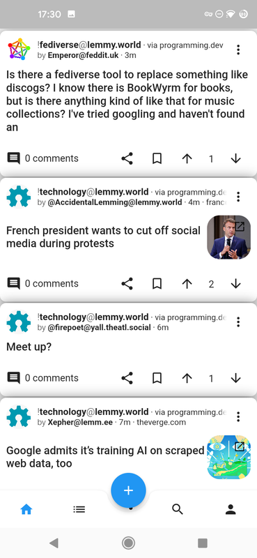
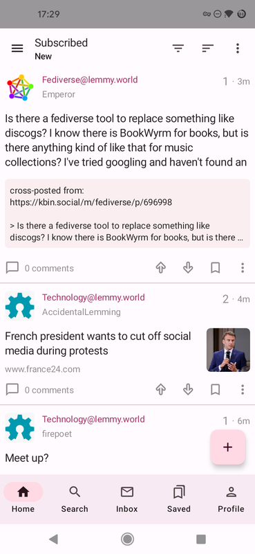
Just for comparison (and maybe inspiration), here is a gallery with screenshots for the same feed in Thunder and two other Lemmy clients:
https://postimg.cc/gallery/6yX27nv
Just an update: theres been a few changes that will make its way to the next release to help with divider colours! These are some screenshots of the dividers. Let me know your thoughts on this (these are with Material You theme off)
Light Mode:
Dark Mode:
Pure Black Mode: