

This is basically my most traditional bookbinding project. I used regular fabric cloth for the cover, and followed the traditional steps. The interesting (to me) change is the use of a CO2 laser cutter to mark the fabric. Here’s the steps to making it:

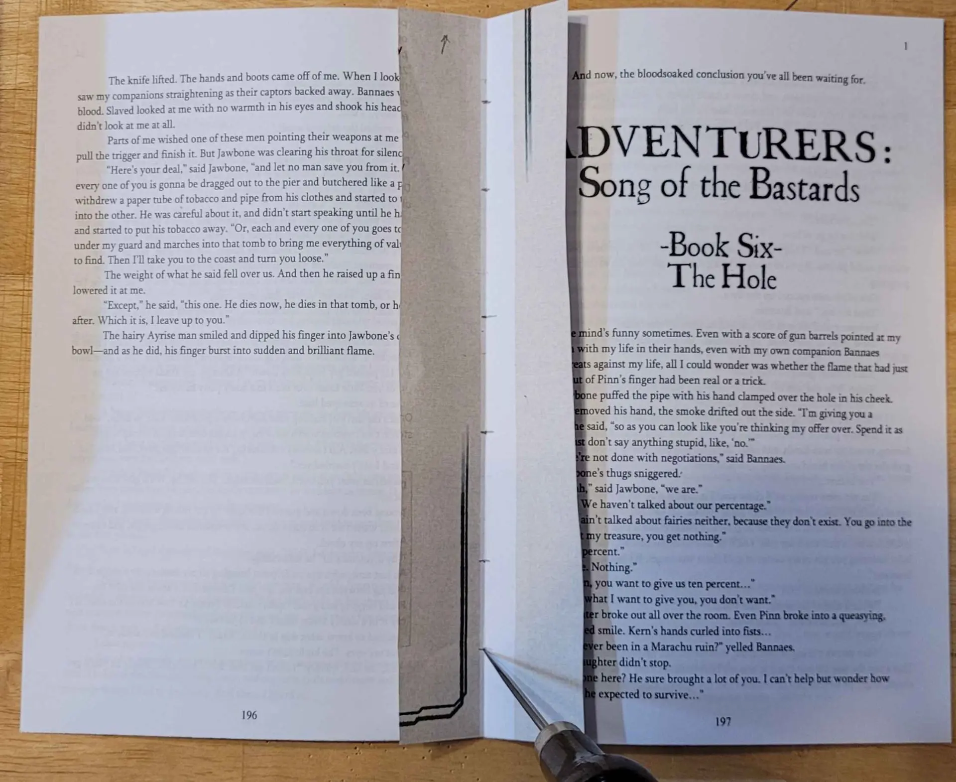
I think it’s fair to say that this book is extremely rare. The author has told me that the one physical copy I’ve made is the only one in the world, aside from an ‘ugly stapled proof [he has] in a drawer somewhere.’ The book was released on patreon as serialized fiction, with each of the six sections being made available as early drafts to a certain tier. The plan was that he’d put them up briefly, take them down again, then compile the drafts and eventually release a full published version. For life-happened reasons, the last step never got done (though the author was kind enough to repost the six sections on a discord channel when I asked).
Just the same, it was one of my all-time favorite stories, so if it wasn’t likely to end up somewhere I could buy it, I was at least going to make a copy of my own.
So I took the six pdfs and started editing them using whichever online tools seemed like they’d do the best job. I started by cropping the files so they’d fit the correct aspect ratio for 8.5x11" letter paper folded in half, but started getting fancier as I went. I removed pages of bonus content from the back of each one so it’d flow better as a book. I merged them all together into one file (to reduce the number of mid-book blank pages from turning it into folio signatures). I even added a second set of page numbers to the bottom because the ones in the top right restarted in every section. I manually added some blank pages front and back.
By the time I was done, I had something to feed into https://momijizukamori.github.io/bookbinder-js/
I used that to create letter page folio signatures (with sets of 4 and 3 pages per signature). Now I had something I could actually print. We did so on a regular office photocoppier, and I can’t recommend printing each signature separately and organizing them with paperclips enough. I would have lost my mind trying to sort them otherwise).
We start off the actual bookbinding in a pretty familiar way, taking each signature, folding each page of it in half with the bone folder, nesting them, and adding that signature to the stack.

Then I used my template from the previous bookbinding project to punch holes through each signature. One really nice thing about not having to trim whitespace from my pages is that the overall page size (and thus most dimensions of the cover except the spine) will remain the same no matter what is printed on the page or which printer I use. So I can reuse things like this template.

Here’s my template with its measurements in case you want to reference it:

Eventually this left a nice stack of signatures ready to sew together:

As before, I sewed it together using waxed thread, following the Penrose Press Pretty Perfect Paperback Guide. I know there are a bunch of ways to do this, but I quite like this technique.

The next step is to clamp and glue the bookblock together. My clamp is pretty crude, it’s just a 2x4’ screwed to a piece of particleboard, with a couple ragged sheets of wax paper keeping the book from gluing to the clamp.
The goal is to get it as tightly pressed as possible while keeping the book block nice and square.
I didn’t take a picture of this step for this project, so here’s one from the last book. Note how the signatures are jumbled along the edge. I’ve gotten much better about lining them up recently.

I usually use my finger to work the glue into the gaps these days, it’s faster and makes less mess than the brush. I think it gets into the gaps better too. I do three coats of glue on the spine. For hardcovers like this one, I then glue on a strip of mull or cheesecloth which is a couple inches wider than the spine on either side (front to back), and like an inch or so shorter than the top of the spine (heightwise).
Then I glue on a strip of watercolor paper (it’s supposed to be manila paper but I don’t have that).

Now it’s time to start on the actual cover. I size the bookboard so it’ll overlap the book block by 3mm on the top, bottom, and open edge. You’re supposed to make it 3mm wider for that overhang, but then remove 6mm for the hinge by the spine (so that’s actually -3mm) but I haven’t had good luck with that, the open edge always seemed too close to the book block, so I just leave it the same width as the book block and slide it out 6mm. Somehow that works.

To get the spine width, you’re supposed to measure the spine of the book plus one thickness of bookboard, but my spines often come out a bit thicker than the rest of the book so I’m sure about that guidance either.

That’s the basic layout but I wanted the color to be darker. I was reusing fabric I bought for a halloween costume, but I was picturing more of a maroon color. I didn’t want to buy new cloth when I had a bunch on hand I wasn’t using, so I decided to dye this piece.
I started off trying to use some very old, expired, dark roast, decaf coffee, but the cloth just wouldn’t take the stain, likely due to not being natural fibers. So instead I switched to using some old rit dye I had. I took lots of pictures for the coffee and almost none for the rit dye, so just pretend it’s slightly blacker and in a different pot. And that I’m using a stick instead of a wooden spoon.

The nice thing is the rit dye isn’t really going to go bad, so I just poured it from the old pot I used (we stopped cooking with it because the nonstick lining had started to flake) into an old jug. I’ve actually reused it since and it worked fine!

After a lot of hassle, the rit dye finally made the difference.
I ironed the cloth to smooth it out:

And glued the bookboard down onto it. Make sure the gaps between the spine and the front and back is 6mm and that they’re square/in line with one another.

The next step is to trim 45s off the corners (leave one bookboard’s thickness between the corner of the bookboard and the cut edge) and to clean up the edges.
Then I applied glue to the bookcloth and bookboard and wrapped each edge over:

My attempts at this look kinda crude, but you don’t really see this once the endpapers are glued on, so it doesn’t bother me yet. Someday I’ll probably look back on it and wonder why I thought this was good enough, but for now, it works just fine.
(You might notice that I glued the cut-off triangles to a scrap of bookboard, that’ll come into play later)
When you apply glue to the endpapers they’ll kind of liquify a little and stretch, so trim a couple mm off the leading/open edge. It’ll look better.
Okay, final assembly. This is where it all comes together or goes horribly wrong.

To do this you place the bookblock inside the cover and get it positioned how you want it. Open up the cover again, slide a piece of wax paper and a piece of scrap paper in between the topmost endpaper and whatever’s underneath it. Make sure the scrap paper is on top.
Get your brush soaked with glue and then dab it on some scrap until its not really soaking where it hits. Use little vertical jabbing motions (Psycho style) to stipple the top paper so its completely glued. Apply glue under the mull/cheesecloth, then put the cloth in place, then apply glue on top of that.
When there’s a good layer of glue everywhere take a deep breath and close the cover onto the page. Open it just a crack, look for wrinkles and smooth them out as best you can. If you open it too far the paper will pull away from the cover.
When you think you’ve got it as good as it’s going to get, remove the scrap paper but leave the wax paper. Close the book, put something heavy on it, and hope for the best.
When its dry, flip it over and repeat the whole process.
We’ve now hit all the usual steps (except the end ribbon thing but I don’t see the point of that). I was honestly very pleased with the results.


But lets get fancy with it. I had some time on the CO2 laser cutter at my local makerspace, and I’d seen online that people had managed to etch bookcloth, so I wanted to try finishing things that way.
We started with some tests, on very low power and working our way up. We weren’t sure how well the poly-blend fabric would handle the laser, or what kind of damage it would cause.

We started with the settings for printer paper (95 speed, 10% power) and worked up by 5% increments, finding that the quality improved each time.
Once that was done, I banged out a quick cover layout by measuring the book, drawing a vector rectangle in those dimensions, and positioning the raster title in the middle.
We ran it with the lid open (runs as a test with just a visible dot) and made sure the rectangle followed the edges of the book.
I had to prop the cover open a little so it’d be more level (I used one of the little connector things we use to pin warped things to the work surface). Then it was just a matter of hoping for the best and rerunning the file with the lid closed.
It was kinda high stakes but I’m very pleased with how it tuned out.
#diy #bookbinding #lasercutter #etching
Ah! I am a beginner, and use a much thinner quilting cotton. To prevent the glue showing I have to fill with mix of acrylic medium and starch paste (haven’t found a ratio I really liked), or to back the cloth with paper. So to me your casing looked like witchcraft! I really like the etching effect. No idea how it’d work in practice, but it seems like you could make some gorgeous illustrationy covers by going over the cloth multiple times at different strengths for different values.
I’m definitely a beginner too, especially with using actual cloth - I think I just got lucky with which fabric I happened to have on hand.
This simple beginning definitely got us thinking about more elaborate stuff to try in the future. Part of why I did a basic cloth hardcover was that the author never made any cover art for it, and partly that I just thought it would be a good fit for the feel of the story. But for some of our own I think we can do some really cool versions of their cover art in this format. Part of that would be inverting the colors and dialing in the contrast for clarity.
I’ve seen some really cool looking illustrations etched on online demonstrating the potential: