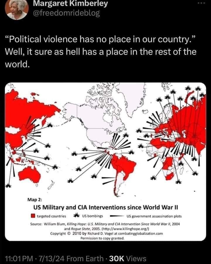
Why would that matter? This data has nothing to do with population.
It’s also the one everybody already know where to find anything.
That’s quite a subjective and eurocentric perspective.
But anyway, how the fuck the projection isn’t symmetrical for the North and South hemispheres? How does one achieve that?
This appears to be a Mercator projection, or something close to it. The land in the southern hemisphere is generally close to the equator so it appears smaller as part of that distortion. Also it looks a bit weird because Antarctica usually balances that out visually, but is excluded for this map.
There’s a lot of different options for displaying different kinds of information. For what this map is trying to convey, it makes sense for it to be centered on the US. The distortion doesn’t really matter because distance is not important. Keeping large populated is not important because the map isn’t conveying any information related to population. Is this the absolute best projection available? Probably not. But the Mercator projection is still far and away the most common today (and I see this is copy written 2010, so it would be been even more ubiquitous then).

Ew, the america centric map projection, cut eurasia in half, why?
What would the argument be for using a Euro-centric map for displaying data about US military interventions across the world???
No one ever uses this nonsense
It doesn’t cut a large populated land in half. It’s also the one everybody already know where to find anything.
But anyway, how the fuck the projection isn’t symmetrical for the North and South hemispheres? How does one achieve that?
Why would that matter? This data has nothing to do with population.
That’s quite a subjective and eurocentric perspective.
This appears to be a Mercator projection, or something close to it. The land in the southern hemisphere is generally close to the equator so it appears smaller as part of that distortion. Also it looks a bit weird because Antarctica usually balances that out visually, but is excluded for this map.
There’s a lot of different options for displaying different kinds of information. For what this map is trying to convey, it makes sense for it to be centered on the US. The distortion doesn’t really matter because distance is not important. Keeping large populated is not important because the map isn’t conveying any information related to population. Is this the absolute best projection available? Probably not. But the Mercator projection is still far and away the most common today (and I see this is copy written 2010, so it would be been even more ubiquitous then).