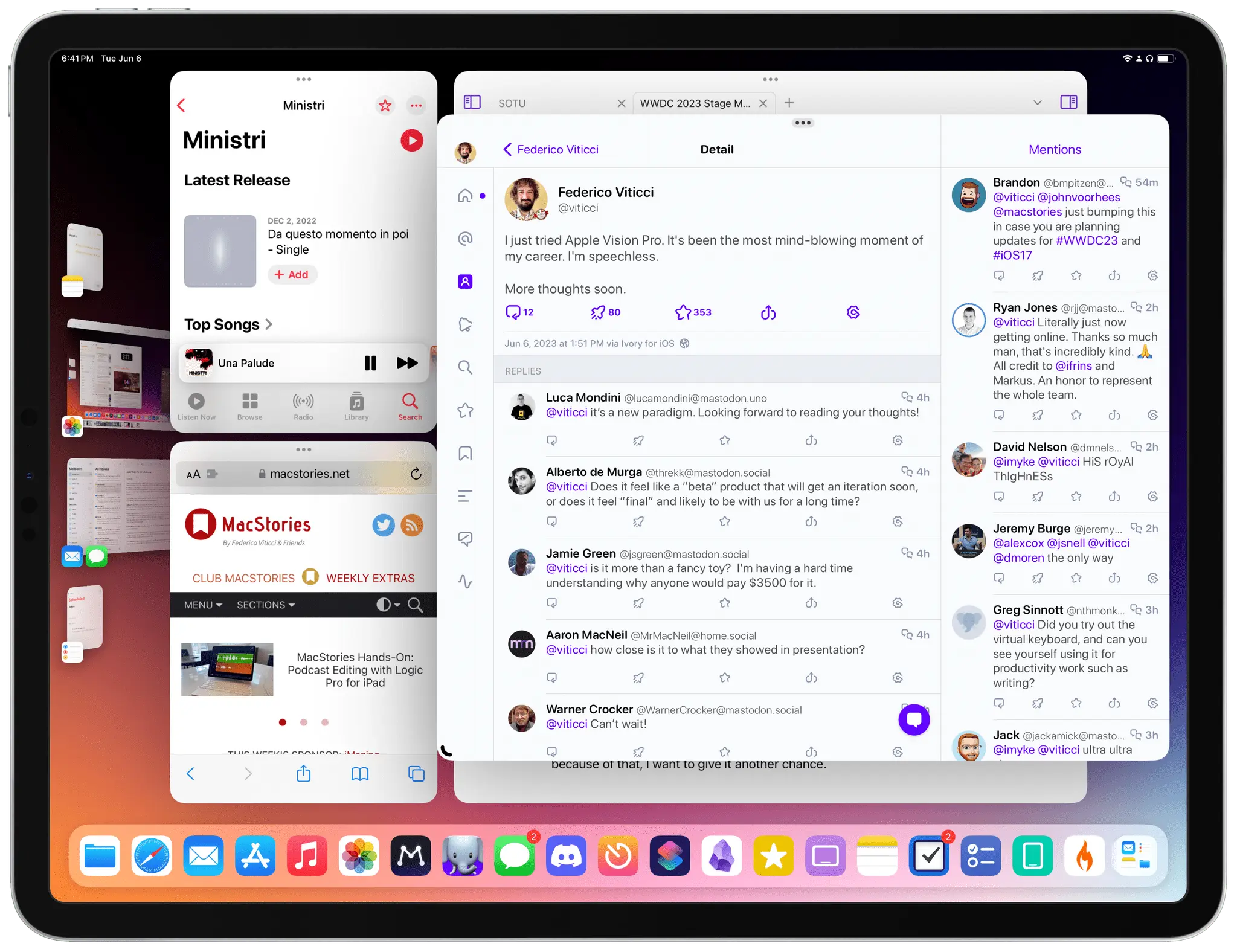
There are still bugs with Stage Manager and, look, this is not surprising given this is the first beta of iPadOS 17.
interesting to see how Apple is bringing out stage manager for macOS, what’s the point of stage manager on there anyway?
I gave Stage Manager a fair shake for a few days when I first installed Ventura, but even after a few days I was damned if I could work out what the point of it was. It wasn’t better in any way I could see than just fullscreening apps, or having task-related apps on a new virtual desktop.
The only thing I could say for it is that if you’re coming to macOS from iPad, there’s a systemic familiarity to help you transition.
But otherwise all I can say is that at least it’s optional.
If the windows snap on a grid similar to iPadOS (I don’t have a Mac anymore), I could see it being handy as a pseudo tiling window manager. But if they don’t snap, then yeah it’s just reinventing the wheel, with virtual desktops already being a thing.
They don’t snap in the current Sonoma beta for me, unless I’m really missing something (always a possibility). I don’t mind the existence of Stage Manager on macOS, and I can see its utility for some folks (people who don’t use Spaces/multiple desktops, for example), or folks for whom a window-centric way of working makes more sense to them than an app-centric one.
I’ve been a Mac user since the late Paleolithic and hiding and showing apps feels too ingrained in my head for it to change at this point. hehe. So long as things like Stage Manager add to the Mac user experience rather than replace longstanding conventions, I don’t mind.
But then, even those longstanding conventions change, sooner or later. (OS X is not classic Mac OS, of course.) I’ll adapt; it’ll just feel unusual for a while, in the meantime.
deleted by creator
I use a mix of multiple desktops, fullscreen apps and Stage Manager for my current workflow. I still haven’t figured out all the kinks yet, but it’s definitely convenient.
I like it on my large 32 inch monitor. I can create app groupings that I can quickly switch between. I don’t think it’s as useful on a smaller screen
Works great even on the smaller screen on my laptop. Didn’t even know it existed, but today I was trying to clean up my system and streamline some work things and I discovered two things that I didn’t even know about:
- Stage Manager
- App groups work better than separate desktops for me.
- One group of social media apps, one with my browser, one with the finder, or some variations of that. They are dynamic and whatever I need was probably recently used so it’s just waiting for me off to the side to drag over to the current group if I need it. Goes home just as easily. Just flick it over there and it’s gone, but available.
- Stacks
- A stack on my dock for work apps and frequently accessed folders, another for apps, reading materials, text editors, another stack for social media
- I had never liked the dock really at all, this finally actually makes it useful for me and in ways superior to what had always been my favorite (controversially) way of doing things… just a standard-ass Windows 95 start button organized with folders
Between the two of these things, I am actually able to do everything way faster than I had been. I’m sure if I put the time in I could have figured out how to make spaces, launchpad, mission control, various other MacOS features streamline like this, but I never was able to. It’s all so basic but suddenly I’m actually able to do work fluently and stay organized which I really hadn’t been able to do since switching to MacOS years ago.
If they ever allow the Apple Pencil to interact with the windows and make a proper cursor for using a mouse, Stage Manager will surpass Samsung DeX for me. I miss using the stylus with DeX and being able to navigate the entire system, even the onscreen keyboard with swipe to type was great.
Neat. Maybe I’ll give it a try.


