His logo sucks I have to read right to left like a weeb?
“They made me”. He loved it.
Yeah, there’s no way a library is making someone show up at City Hall for an award.
I’m sure they didn’t really “make” as in “force” him too, but I can see him showing up, not realizing it would be with children, and them just instructing the winners to stand for a photo. He could have objected, but what would he say? It would be hard not to have objections come off as “I’m out of their league,” like it might make the children feel bad.
Haha, there was definitely a conversation ending with him saying “look. I won, right? Right!?” Then I get to go, I GET TO!"
Girl on the left didn’t even try. Obvious stock photo.
I was thinking that. Unless she took the photo herself.
Isn’t that the purpose of stock photos? Finding and chosing the right stock photo can be part of the process. Of course the license must be right.
The real question is, if the result is good enough to award her, which is debatable.
1000x better than participating and finishing 2nd or 3rd and still have to show up with the other 2 kids.
Why did they allow an adult to enter a contest for children? I have so many questions.
Knowing libraries?
They either didn’t put an age range there so as to not discourage young adults or they mentioned it as being linked to some young readers program but didn’t say “for the young readers.”
That or he just missed that and, since it was probably mostly parents communicating, no one realized what happened until it was time for the photo and everyone was too awkward about it to say “Oh, well #2 here wins then.”
Could also be something similar that happened to my wife recently. She 's had her library card since she was like 14 and the library still has her labeled as a child.
I had some weird stuff like this happen when I went into post-secondary classes. I had taken some programming classes as part of the so called gifted program in elementary school and my student account was configured wrong from being made before several large changes to how student accounts were managed. I got to keep my student number which had two fewer digits than everyone in my class at least, but the id verification, emails, phone calls, and taking a number and waiting in line were all a pain and I almost missed the registration deadline.
That or he just missed that and, since it was probably mostly parents communicating, no one realized what happened until it was time for the photo and everyone was too awkward about it to say “Oh, well #2 here wins then.”
I could see that.
Because they wanted the best local talent an “award at City Hall” (and maybe a $32 gift card to Applebee’s) could buy.
Source: worked for a major city library with an enormous budget that used a kids “design contest” for their marketing materials and library cards. Lol
I like the middle one so much more.
it is nice, it would just be too cramped and busy when printed on a handheld card
i think that’s why he won, because his design is relevant, cute, and simple enough to display well on a small card
No you see that’s the actual size of these cards.
Makes it easier not to lose them and you can use it as a makeshift tabletop to hold your tea or hot chocolate when you read.
That’s my pick too. It has the most character.
Once when I was young but not that young I woke up hungover to the radio host simplifying a complex issue and asking for calls on opinions. I struggled up to my landline phone, called and was in pain and pissed off. Luckily I was caught by the producer asking my age before putting me on air as it was a talk show for tweens and I’d passed the age of the target group by some generous margin.
I can just imagine you starting the interview for a kid’s show, completely hungover and loudly declaring “listen here, you fuckwit!”
Absolutely dominated? The glasses one is just as good mate.
The glasses one has to be the worst one up there. If I found a library card on the ground and the first thing I saw was glasses on a book I would walk past it. It doesn’t convey any information with a quick glance. I can’t read any of the book text, but I imagine it doesn’t say “Fullerton public library.” So it would just look like some kind of bible leaflet that you see on the ground in Vegas that when you pick it up either has nudes on the other side or a bible verse of how I’m gonna go to hell.
I’m willing to bet there hasn’t been a library card in your wallet for many, many years lol
My library card isn’t in my wallet because I keep my smash pass for your mom in there.
You need a smash pass for his mom? Rough. Whenever I go to your mom’s, she just does walk-ins. No card required.
It’s more of a punch out coupon card.
I have to threaten all of your mom’s with a block when they start texting me hook ups too much when I’m trying to sleep.
i solved this by issuing @billy_bollocks’ mom a 10-visit punchcard so she would stop calling me to come over so often
Y’all got nothing on me, I fucked all your dad’s back to back.
This devolved quickly.
That one looks like a stock photo. It’s so generic.
Glasses are too stereotypical - and negatively connoted. But the domination most probably was a hint on the voting results ;)
I prefer the tree branch one, but to each, their own.
im sorry but no, it is not
he won by a large margin
Maybe it was a shortlist and then voted on by the public, thereby allowing him to ‘dominate’ the vote.
I mean we don’t know the specific results of the judging. The grading could have been a landslide in their direction.
Art is subjective after all.
So? Like. What IS the Picard Maneuver? I only watched the 60s Kirk ST series.
Officially, “The Picard Maneuver” is a trick that Picard came up with to fool enemy sensors into seeing two ships and not knowing which to fire at.
Unofficially it’s the way Picard always awkwardly readjusts his uniform (which is what my profile pic is). He does it constantly.

There was also a Riker Maneuver, which was unofficially the way that Jonathan Frakes stepped over the back of a chair to sit down.
That gif is improved with DJO’s gun loading sound.
I’d be happy, happy in Paraguay.
Needs more Zeppelin and cheddar cheese.
Well I love this. Thanks for the educating and all the great memes!
My pleasure, moistclump.
In-universe is an attack pattern of jumping to maximum warp (possibly to dodge weapons fire as well) to point blank range of an enemy vessel, and unloading all available weapons before they can react. Picard described it as a desperation measure he used while in command of the Stargazer in combat with a Ferengi ship.
In pop-culture, it’s standing and pulling a shirt down to present a clean front. The two-piece TNG uniforms had elastic bands at the waist and would ride up while sitting, so Picard would stand from his chair and straighten his uniform every time.
🌈 ⭐️
It’s when Janeway steps over a chair on her way to murder Tuvix.
Also, I honestly go back and forth between which is my favorite series: TNG or the original. I’ve been itching to start another rewatch of the original series lately…
I immediately thought of the Simpsons
Yeah! And he beat their brains out!
This whole instance is insane – insane, I tell you.
Now with AI…
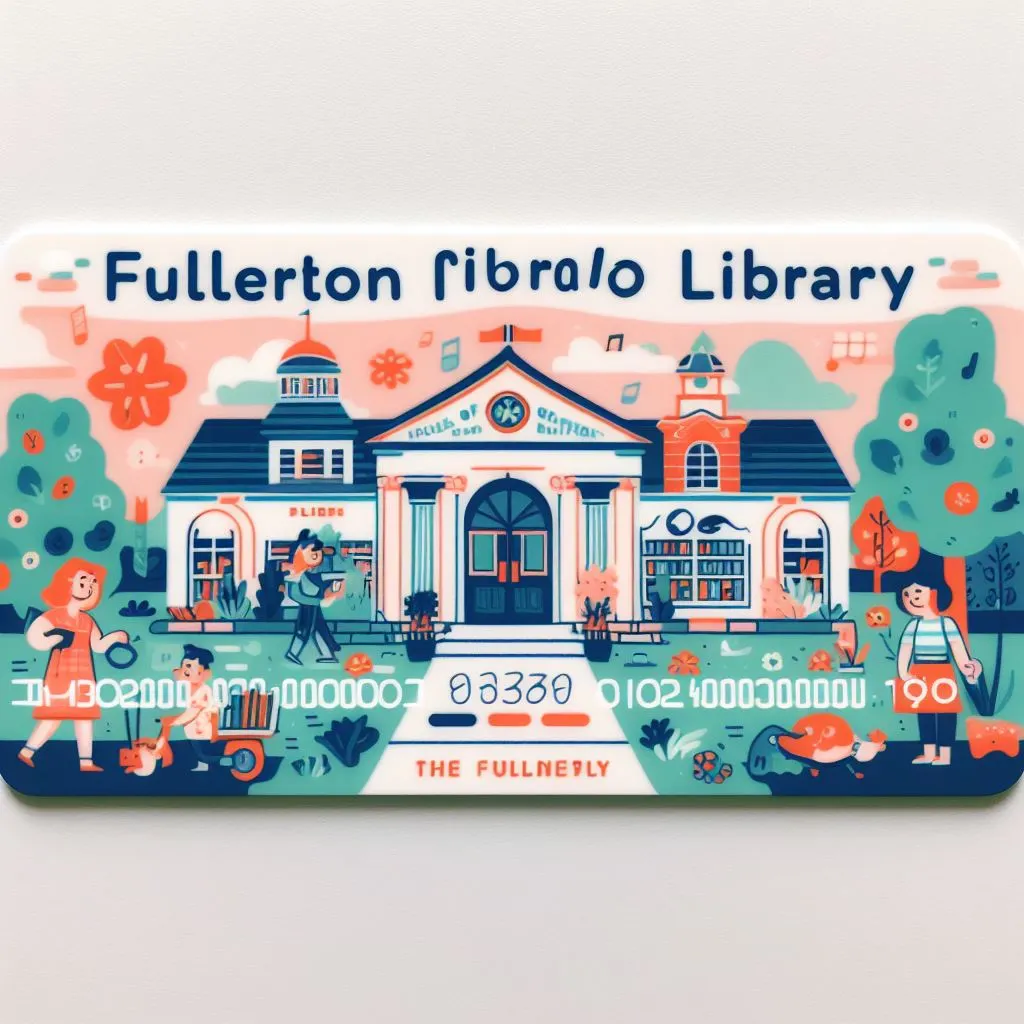
I like this one
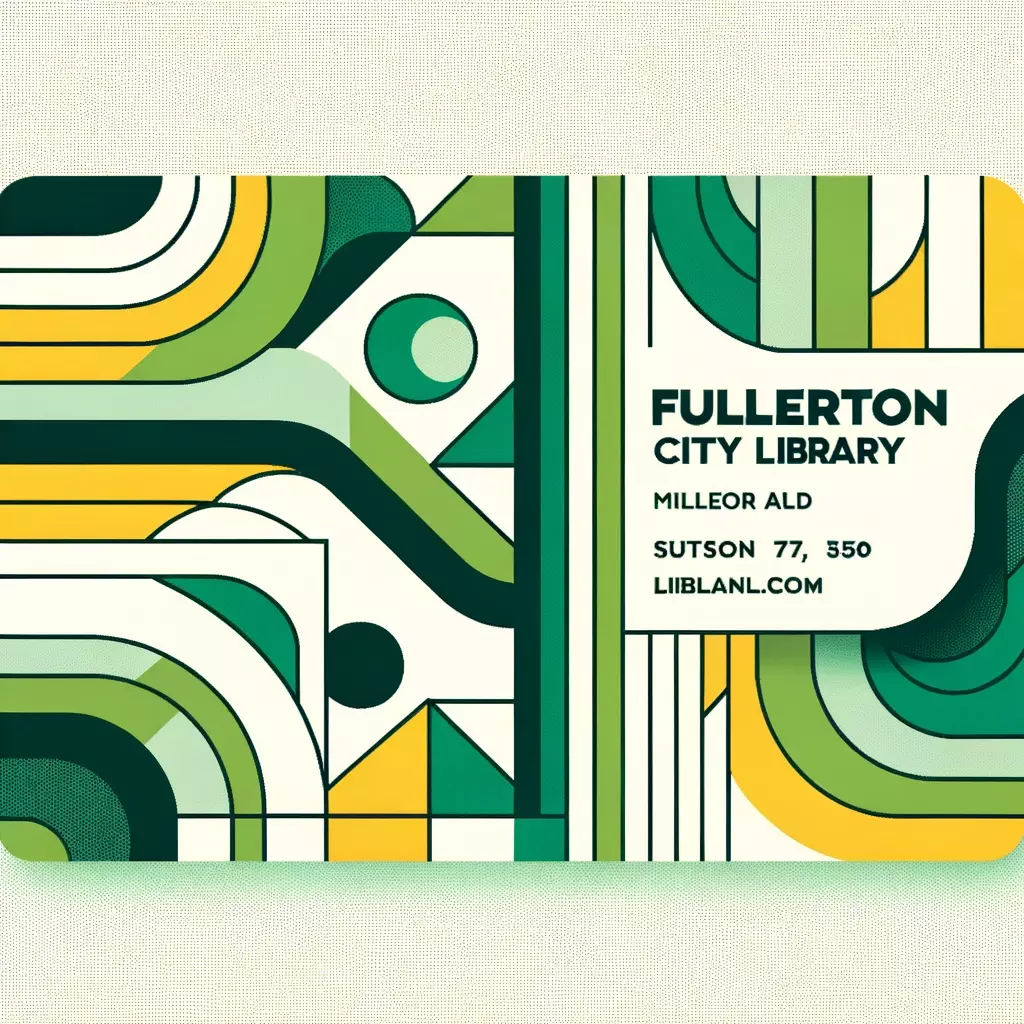
Me too. I dont know if it means anything but it is very aesthetically pleasing.
Oof… Looks bad. Ai has a lot to learn.
It look nice at first glance, but ai isnt good at coherent details. Maybe if someone fixed up, uhh… everything it would be good. Probably easier to make it from scratch then.
Oh no, he’s a filthy dextral…
At least it wasn’t a spelling bee. 😏
That is quite the story.

