- cross-posted to:
- britishcolumbia@lemmy.ca
- cross-posted to:
- britishcolumbia@lemmy.ca
You must log in or register to comment.
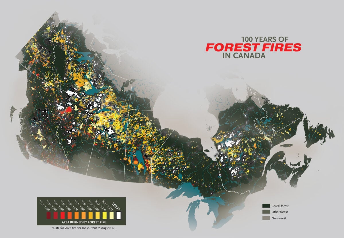
Poor colour scheme aside, its quite concerning how 2023 is a significant leader in area of forest burned. Sort of shows how the impacts of climate change can compound. Drier weather leads to more fires which reduce the carbon sequestering capacity of the forest which leads to drier weather…
Except that you can’t really say that for certain from the map, either—if all the areas that burned over in 2023 also burned over in 1923, I don’t think you would be able to tell. There’s no method for indicating that the same area was burned over twice in different years.
(Note: I am not saying that 2023 was not the worst fire year on record for Canada. I am picking holes in this presentation of the information because climate change denialists will do exactly the same thing, given half a chance. Let’s create better infographics and not give them an opening.)
That statement is based on the article rather than the graph itself.
While past active fire seasons have seen more individual fires — 1989 still holds the record with 10,998 fires — 2023 is notable for the total area burned. The previous record was set in 1995 with 7.1 million hectares burned; so far in 2023, a total of 13.9 million hectares has been burned.
It’s weird, and perhaps deceptive, how untouched northeastern Ontario appears on that map (not 100% sure, but they appear to have failed to map out the Great Fire of 1922, even though it falls just within the timespan in their map legend). We’ve been lucky these past few seasons, though.
Their marking of the forest/non-forest boundary is also deceptive—it makes it look like the area around Lake Nipissing isn’t forested. It is.
So not that good a map.
I interpreted the map to be non boreal, not unforested. If you look at Northern Québec where it is unforested it’s a different shade of grey. I think they could have done better colour selection.
Possibly, but does the boreal/non-boreal forest distinction really matter? I don’t think there’s anything that makes non-boreal forest much less likely to burn if exposed to an ignition source.
No clue there!