alt-text
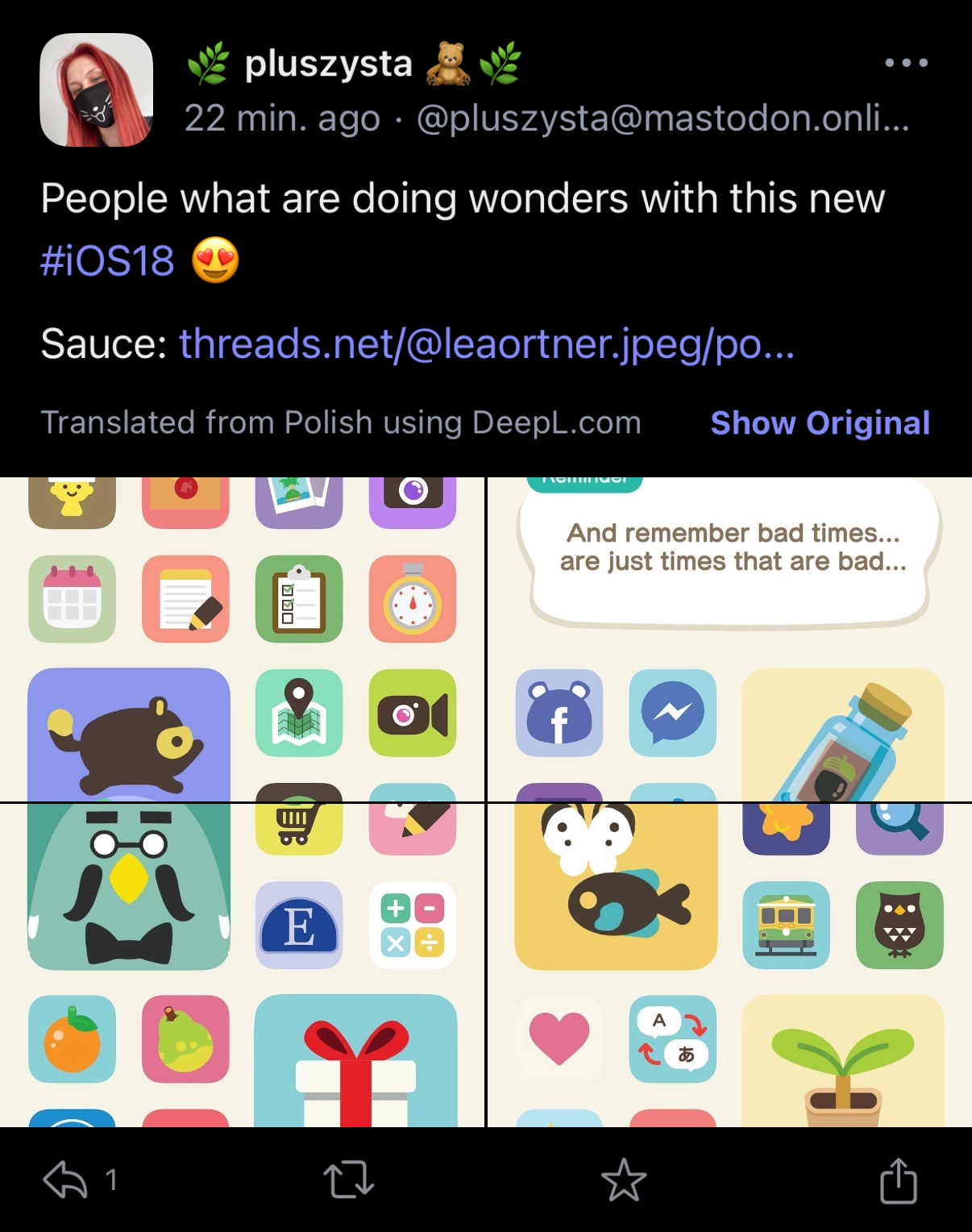
Four stitched screenshots of an iOS 18 home screen. The icons are themed in the style of a “NookPhone“ from the video game Animal Crossing.
Translated:

&:

Reference, apparently: NookPhone
I’d like to try heavily theming my home screen, paradoxically while keeping icons quite recognizable.
Very cool! So annoying that it takes forever to set something like that up.
This is the kind of thing I could spend hours doing during my college days. I remember the golden days of Android custom ROMs and specifically kept a phone that got a rotating ROM everyday (God bless Titanium Backup).
Is it still one shortcut for every app icon you want to customize? And then you have to deal with a notification every time too?
I think you can use cowabunga lite to theme every app and it won’t have the shortcut notification, but it still wouldn’t have the notification counter on the icon
They either changed how the notification works or made it minimal for models with the Dynamic Island. I just tested a simple shortcut to open an app and besides a little blip on the Island it was no different from opening the app normally.
Well, try a 10% of that in iOS/iPadOS.
This is iOS 18.
A perfect example of “give the people what they think they want, and they’ll make something entirely unusable.”


