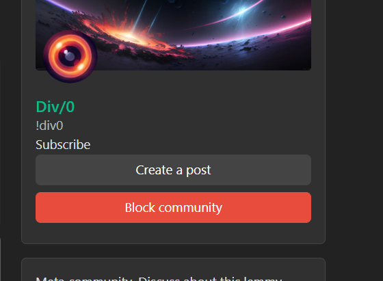
Thanks to the work of @RandomLegend@lemmy.dbzer0.com we now have a new personalized theme for this instance.
The theme is open sourced and lives in this repo. We’re planning to add more themes soon and hopefully a few other cool features like user flairs. If you want to assist improving them, feel free to send PRs or ideas.
The theme is based on the work of @pkrasicki@lemmy.world
If you don’t like the default theme, you can always switch to the standard ones in your user settings
Glad you guys like the new theme!
I am working on a catppuccin mocha themed one, gruvbox is next and nord will be tackled after this. I think dracula is also on my list. If you guys have any preferred colorschemes you can DM me and i’ll put them on my To-Do List 😄
I know how the https://lemmy.dbzer0.com/c/unixporn@lemmy.ml peeps love to have websites in the same colorscheme as their setups! 😀 (that’s why catppuccin is the next i’ll do, so it fits mine^^)
I love this instance. It’s everything I could have dreamt (and more!) when I switched to lemmy!
I never welcome new UI changes.
They tend to modernize.
I like the old designs better for many things, no need material design or the new whatever crap, and don’t change the menus around too much please, I don’t want to work to find out how to use the apps or websites.
The apps or websites should work for me, not the other way around.
So I’m here to complain (/s), this new theme you added totally rocks! Good job @db0@lemmy.dbzer0.com!
Edit: Embarrassed, I didn’t even read the post correctly… 🤦 Good job @RandomLegend@lemmy.dbzer0.com! on the theme :)
(And just in case, leave this theme as a choice if you ever change the default please :P)
Haha glad you like it ;-)
The red text for trending sublemmies and links is hard to read. The rest seems nice.
I thought so too but then thought it’s okay.
It’s on my To-Do List to change next
Looks great. Helps define blocks and the main menu better. Makes me miss proboard/hyperboards.
Tweaking the CSS of those back when I was 11 years old was such a journey.
Awww this is sick. Thank you so much!
Edit: I got it as my theme now and absolutely love it.
glad you like it!
deleted by creator
ohhh im down to adopt this theme, its gorgeous!
any idea how often things break and we need to fall back?
break in what sense?
Presumably they mean breaking css changes with lemmy-ui.
We have a dev site, so we don’t break prod anyway
im ignorant to the theming system here. lemmy is at v0.18 so breaking changes of any kind id expect are nearly a given, just curious to know the chances of things breaking every update be they visual artifacts or broken UI
The move from 0.17 to 0.18 broke all custom themes so it’s a possibility. Hopefully it won’t happen too often. We do have a dev instance do well catch they early
It has quite the character
I can’t click on subscribe whenever I visit a community. Is this as a result of the custom CSS or is this a Lemmy bug?

I’ve heard it’s a lemmy bug. Try a hard refresh
Okay thanks. Seems to be persisting after clearing the cach as well. Hopefully this is fixed in the future.


